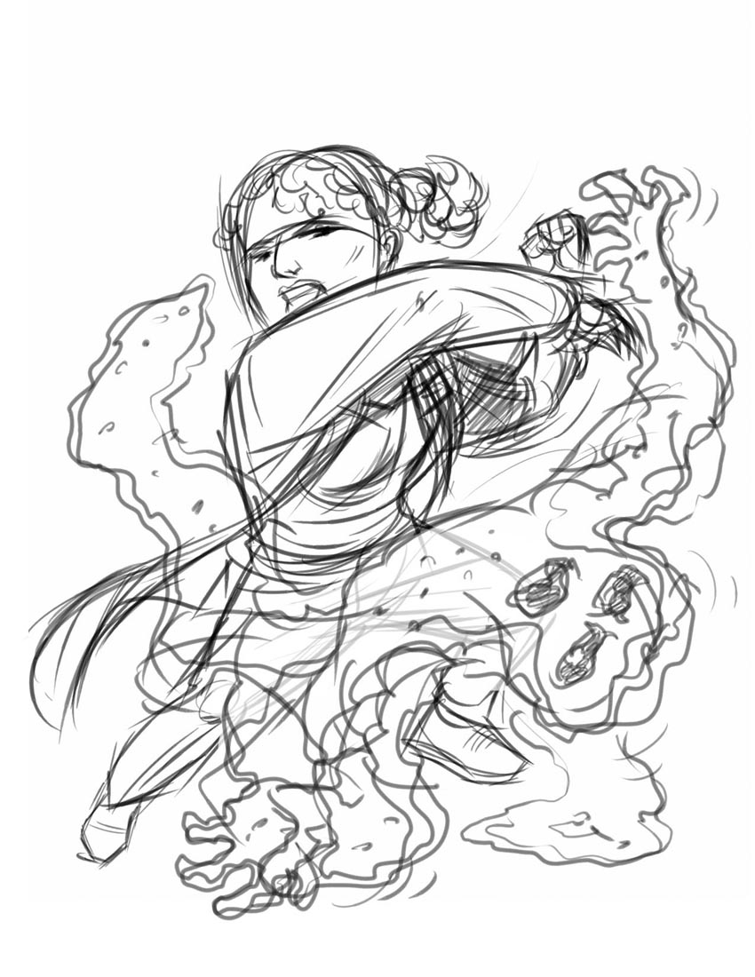
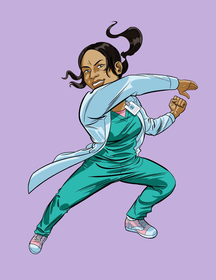
First, I did a very rough sketch in Corel Painter based on the client's concept: an East Indian female doctor battling (and overwhelming) a germ monster.
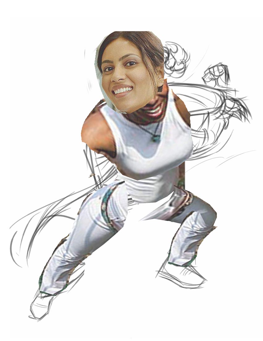
Once I had client approval, I next did a Google image search for appropriate photo reference. Much like the "morgue files" or reference files illustrators used to compile by clipping magazines in "the olden days". The beauty of the computer is how easily these bits of photo reference can be manipulated into an approximation of what you're trying to draw. Here, I chopped up one jpeg in Photoshop, transformed the pieces into a perspective similar to that in my rough, used the same leg for both of my character's legs and a head from another found shot that was a better fit for angle and character type.
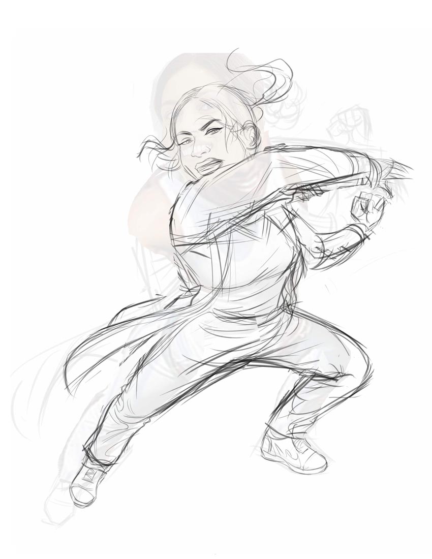
Of course, you don't want to trace off the photos, as Will explained in his step by step. It usually results in a very static, dead looking drawing. But the photo provides a handy reference point for doing a tighter pencil sketch of unusual facial angles and clothing drapery. I do the pencil sketch in Painter...
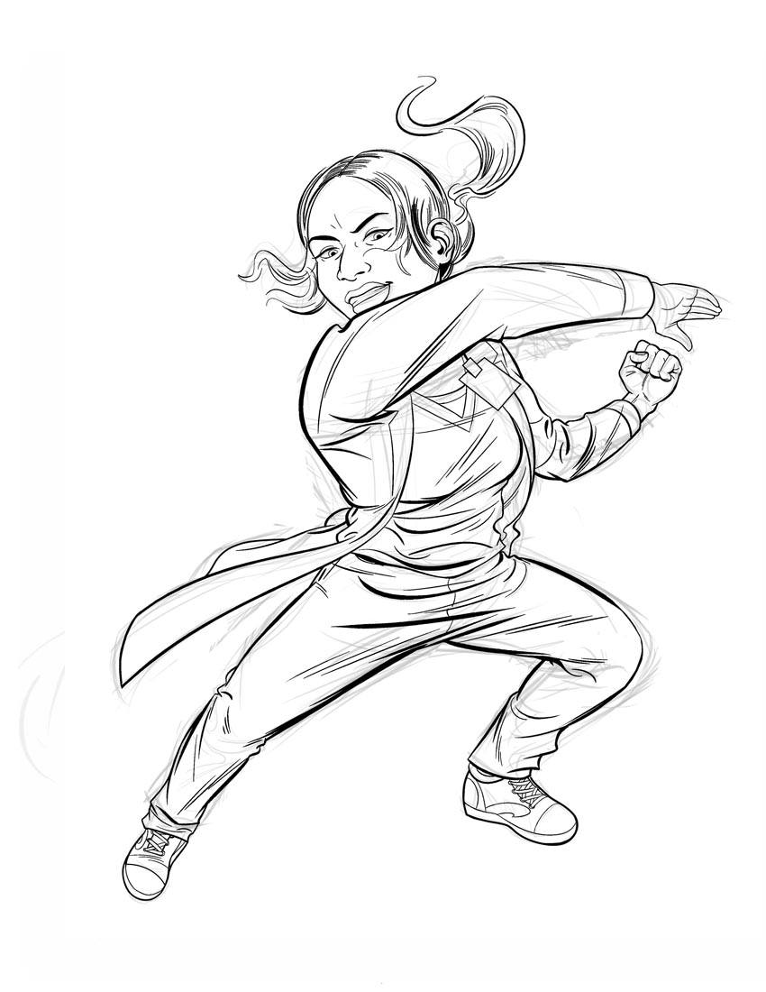
...and the inks as well. I've been using the Pen Tool with the Scratchboard tip on the advice of some other artist's online tutorial. I'm sorry, I've forgotten where I found that advice! I wish I could credit that artists - because I'm very happy with the results. I had been using the Felt Marker tool and then "hardening the line art in Photoshop because it always came out slightly soft-edged. Now I don't have to worry about it anymore and the thicks and thins I get with the Scratchboard Pen are very close to what I used to achieve with real ink and a sable brush.
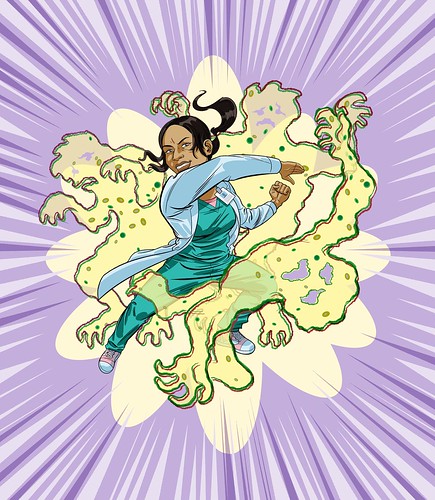
Next, its back to Photoshop for flat colouring. I lift my line art onto a layer, delete all the white, and colour on the background by Polygon Lassoing areas and deleting them to whatever background colour I've chosen for that selected area.

Next, I add shading on a Multiply layer above the background and highlights on yet another layer above the shading layer.
I did the germ monster outline with the Barbwire Pen tip in Painter and brought it in as a new layer. Lots of colouring, effects and general messing around on a bunch of other layers finally gets us to what could be the finished version. However...

... I kind of felt like our heroic doctor could easily whup more than one germ monster - and the composition seemed incomplete -- so back to Painter to do up a couple of cringing pals for monster #1.
Then I thought, maybe she needs a kid who's happy to be rescued by such a confidently heroic doctor. I went back to Painter, drew up this li'l guy and brought him over as another layer.
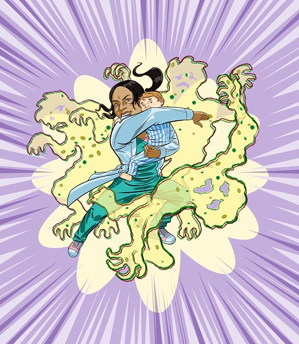
I'm not sure which version will see print, but the client appreciated the extra effort and I had a lot of fun working up the variations!