
These are some of my earliest cards, done in the late '90s before I had managed to land a lot of high-profile accounts. In retrospect they're also some of my favourite, most fun images that I've ever made, because I made them only to please myself.
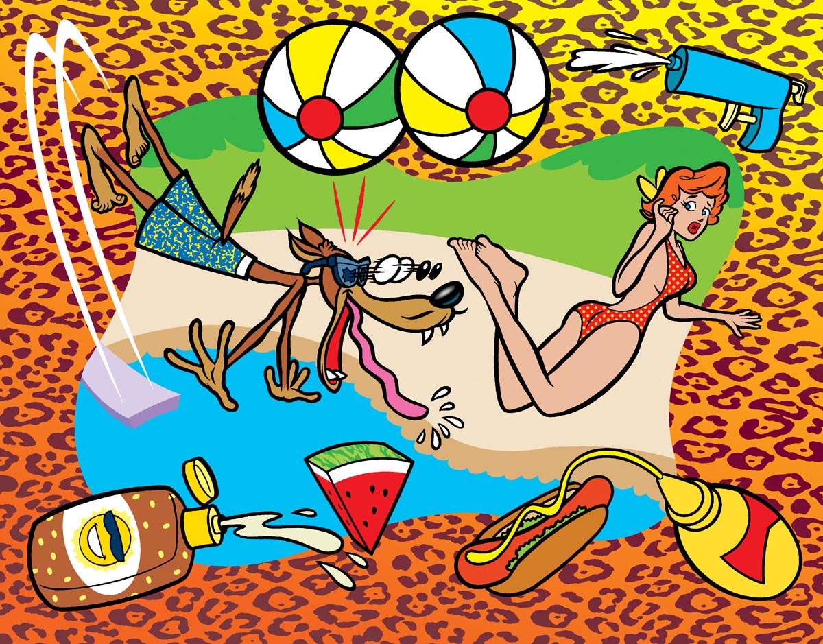
I wanted clients to be a little bit shocked by the mischievousness of the imagery. These were intended for advertising and editorial clients and you know what? They did get me a lot of work!

I think the combination of retro-pop imagery and slightly off-colour subject matter got my work noticed by ADs who, frankly, probably felt a bit cynical (as I did) about the corporate bullsh*t you have to shovel to make a living in the ad business.
Hopefully these cards gave the ADs who received them a moment's pause and a chuckle when they arrived in the mail. It always made me feel really good when I'd go to client meetings and project briefs to see my postcards pinned on their bulletin boards - even several years after I'd first sent them out.

At some point in my career, probably about 5 or so years in, I began to change my promotional strategy a bit. I still believed very much in the power of the promo postcard -- but I began using imagery from some of my more high-profile assignments instead of making up images from scratch.

This strategy wasn't always as successful as I imagined it would be. When I sent this card after doing a bunch of Pokemon art for Golden Books, I figured a ton of calls would light up my phone. In fact, not a single client called. I'm not sure if the joke with the Korean translation threw them... or if Pokemon was too specifically stylistic at the time that clients couldn't imagine what else I might be capable of drawing for them... or what exactly the problem was. But I really loved this card - and concept - and was really disappointed when it failed to generate any new assignments.

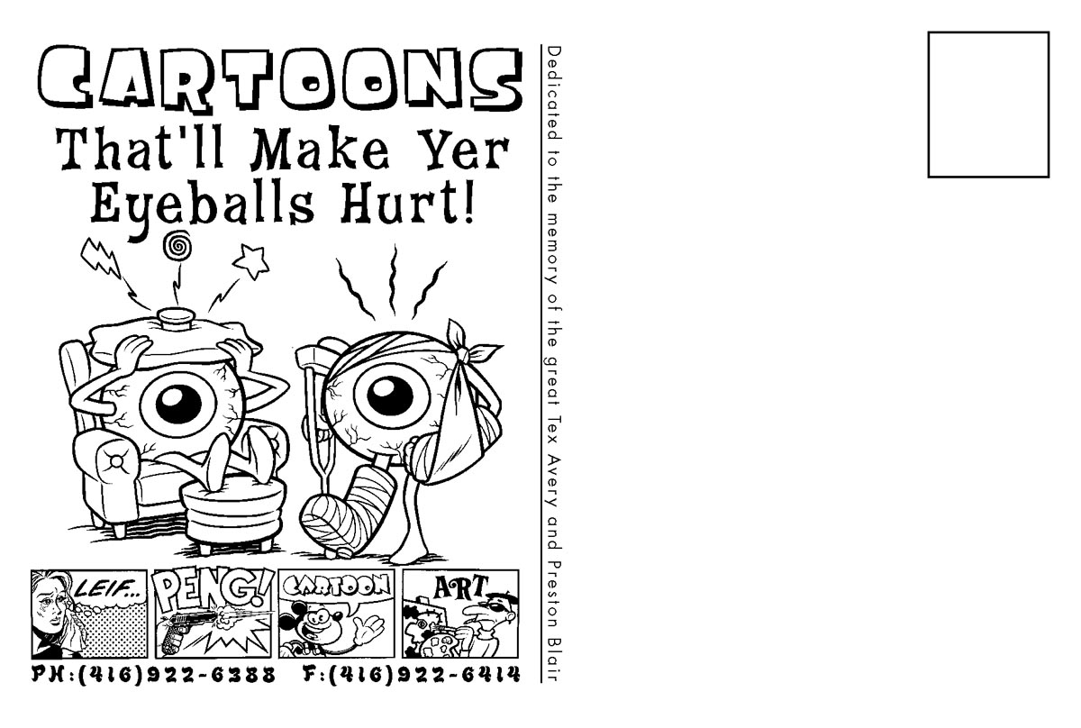
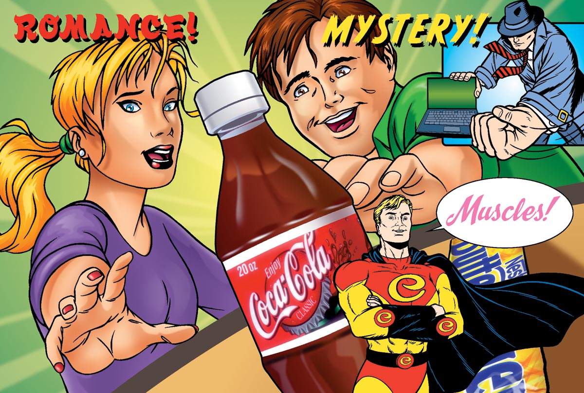
This next effort was somewhat more successful. Again, I tried to make it fun and a little wacky - but still very evident what exactly my specialty was. I seem to recall this card got me a couple of decent packaging art assignments from design firms working on products targeted at the kids' packaged food market.


Around 2001 I had a nice run of luck, doing three covers for Maclean's magazine in a fairly short time frame. (For those who aren't Canadian, Maclean's is Canada's weekly news magazine, the Canadian equivalent of Time or Newsweek in the States, so this was pretty sweet in my books - having my work seen nationwide on every newstand in the country).
I decided to try leveraging that sucess and recognition into more magazine work. I devised a postcard that collaged all three of my Maclean's covers into one image. This card was only sent to magazine art directors in Canada.
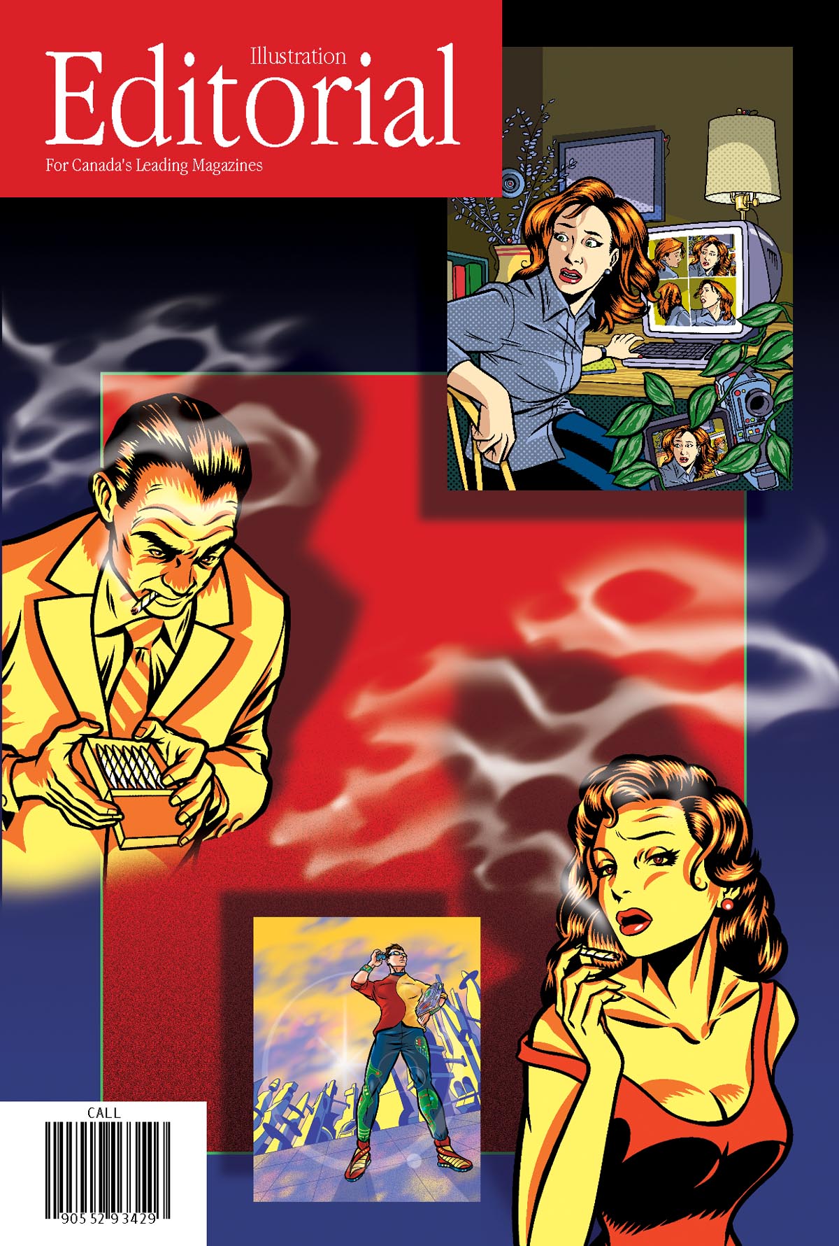
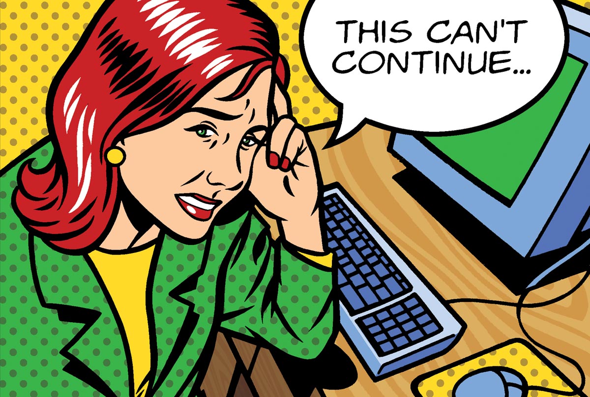
Unfortunately this card was also a dud. I don't know why. Actually, I should clarify that it seemed to be a dud - but to be honest, the illustration business really went south during 2001. Not just for me... a lot of people I've talked with over the years will confirm that after 9/11 business kind of dried up for them too. This seems to have been the case on both sides of the border. My feelings must have been showing in my next effort! I remember doing up this card with a sense of quiet desperation.
I wanted to capitalize on the success I'd had throughout the years creating commercial art with a Roy Lichtenstein/pop art feel to it. For a long time I seem to have been the go-to guy in the Toronto area when clients wanted this sort of look for their project. I still do quite a bit of stuff for editorial art directors where they'll ask for "that Lichtenstein dot thing."
Whether these cards are the reason I've landed those projects or not is up for debate. This is the down side of doing promo postcards: each card ends up costing you about a dollar to send ( when you add up the cost of the mailing list, printing and postage) and you send them off en masse, say about a thousand at once, and you have no idea how much of an impact they've made unless somebody calls you back fairly soon after they've gone out. When that doesn't happen, you can get pretty bummed out. But like I said - the real idea behind the cards is to create an arresting image that and AD will like enough - not just to stop him for a moment - but to want to pin that card up on his bulletin board and look at again and again.
I've had clients call me and say, "I'm looking at this postcard you sent me and I think you're perfect for this project I've got..." and I'll ask them what the image is and think, "Jeez, I sent that card out three years ago!"
Sending promo postcards requires a pretty big investment - both in time, effort and money - but its one I highly recommend. However, its imperative you do your homework! Be critical of your own work and only send your best, most arresting, most appropriate imagery. You have to think like an advertiser, because that's exactly what you are in this case. The product you're promoting is you and your artwork. Try to have fun and be creative, but also be objective and practical - so you're not just mailing dollar bills away with no hope of a positive return for your hard-earned investment.
Good luck! :^)
6 comments:
Nice job, Leif! Thx for posting these and giving some history on them too!
-John
My pleasure John - I'm glad you enjoyed it and I hope it was a bit helpful :^)
Thanks for the post! I am about to embark on a large mailing and feeling somewhat nervous having been out of the biz for a few years. reading this helped confirm that I am approaching thinsg right, and, also, that you simply can't control everything...
Christine
www.christinefrancisbarta.com
Great cards Leif! I really appreciate being able to see an artist's thought process and (perceived) outcome for each mailing. Thanks for the great post!
Hi Leif- very interesting post- some helpful points that will help me to better plan and evaluate my future mailings. Thanks so much!
-Amanda
www.amandacrawfordart.com
Christine, Rick, Amanda;
Thank you all for your kind words and encouraging comments :^)
I'm planning a follow-up post with some more specific info about mailing promos, both from personal experience and from some fellow artists who gave me some excellent tips!
Post a Comment