This month I was commissioned to do a cover for Mac Times magazine, McMaster University's Alumni Association magazine.
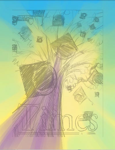
The client asked that I create something that would convey the idea of many generations of a family being McMaster graduates. They mentioned that a "family tree" of graduates was something they'd like to suggest... so here are a couple of thumbnail concepts I came up with based on that theme.
They liked the one on the left.

One sunny Sunday last autumn I had taken a bunch of photos while out walking the dog over at the golf course, and these photos served as inspiration and visual reference for the look I had in mind for this illustration.
I really wanted to try to get a bit of that gorgeous Bernie Fuchs "sunlight filtered through leaves' quality in this illustration. When I Google Image Searched Bernie Fuchs, this image came up.
Perfect.
I began roughly painting the base colours in Corel Painter. I used the Oil Pastel tool to lay in the beginning of my colour scheme.
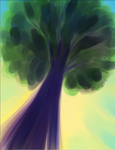
Here's how it looked after I'd 'painted' in the base colours, building up some tonal contrast.
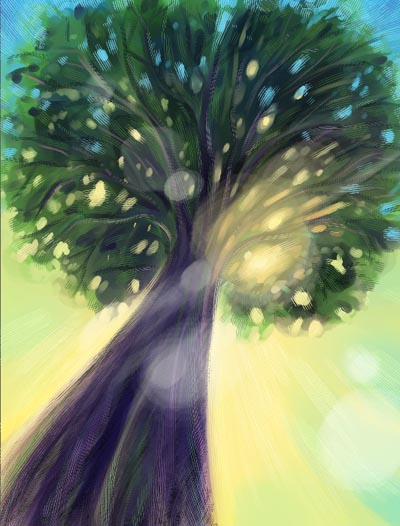
Next I began adding filtered light (à la Bernie Fuchs)...

... and textured the whole thing with one of my favourite Painter tools; the Scratchboard Rake.
Final touch: some "lens flare" effect (although NOT using an actual Effects filter - just oil pastel).
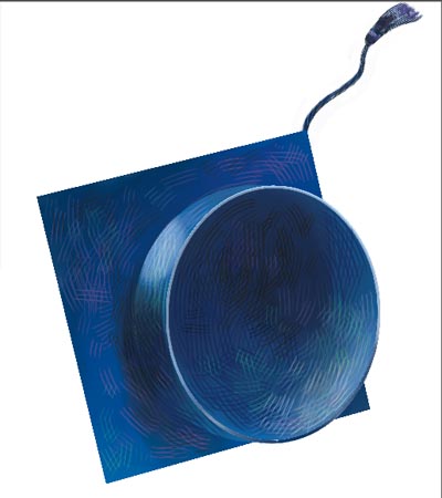
Here's the graduation cap (or "mortar board") painted in a separate file.
The finished piece, after dragging in, resizing and rotating many copies of the mortar board.

Here's how the finished piece with text in place looked once the magazine was printed!
The client asked that I create something that would convey the idea of many generations of a family being McMaster graduates. They mentioned that a "family tree" of graduates was something they'd like to suggest... so here are a couple of thumbnail concepts I came up with based on that theme.
They liked the one on the left.

One sunny Sunday last autumn I had taken a bunch of photos while out walking the dog over at the golf course, and these photos served as inspiration and visual reference for the look I had in mind for this illustration.
Perfect.

Here's how it looked after I'd 'painted' in the base colours, building up some tonal contrast.

Next I began adding filtered light (à la Bernie Fuchs)...

... and textured the whole thing with one of my favourite Painter tools; the Scratchboard Rake.
Final touch: some "lens flare" effect (although NOT using an actual Effects filter - just oil pastel).

Here's the graduation cap (or "mortar board") painted in a separate file.

The finished piece, after dragging in, resizing and rotating many copies of the mortar board.

Here's how the finished piece with text in place looked once the magazine was printed!

You can see more of my editorial art here and some of the other magazine covers I've done are here


6 comments:
Nice nice nice
Wow - so fast! ... thanks Kristen :^)
I like it...
Thanks very much, Judy :^)
i love posts like these, thumbnails, photo reference, simple illustration, and step by step, has everything.
Nice post keep'em coming!
Thanks Zoheb - I'll try :^)
Post a Comment