Pages

Monday, June 22, 2009

GAAH! It's Father's Day!!!

I don't know about you but nothing makes me happier than a home-made gift. This year for Father's Day, my two super-cool sons made me extremely happy.


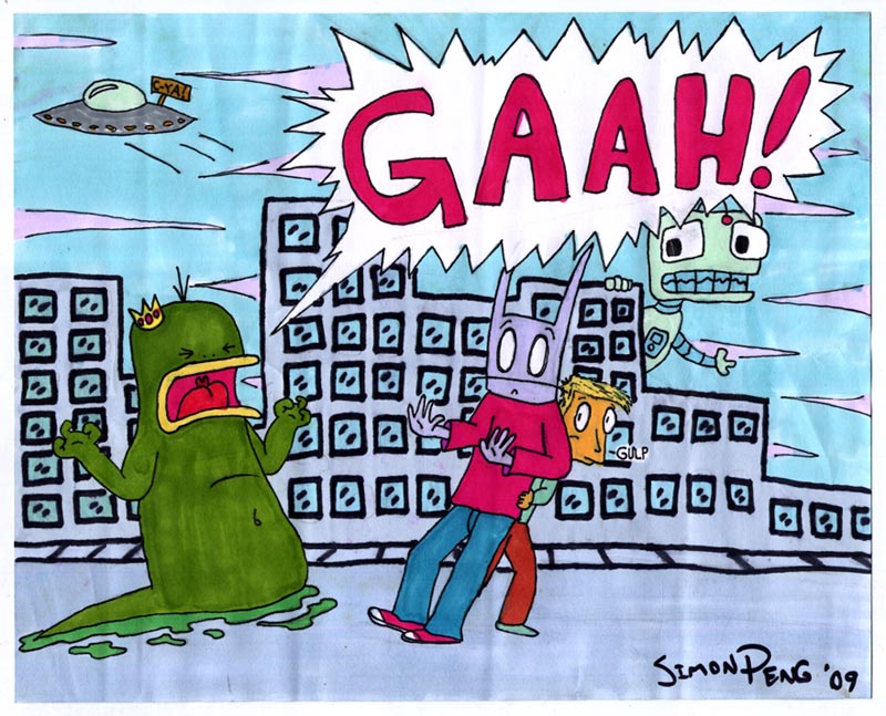
Simon presented me with this awesome full colour original King Flabu-Flabu illustration. Simon rarely works in colour (and if he does its usually digital colouring) so this is a very special treat. Si pointed out to me that this is the first time he's ever drawn King Flabu-Flabu getting all emotional. Why is he so irate? I know better than to question an artist about his motives. I'm just pleased as punch that Si would create this beautiful piece for his old man.
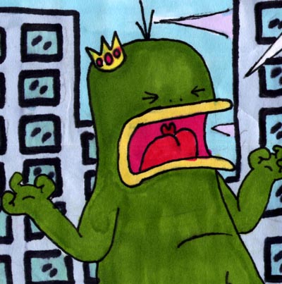

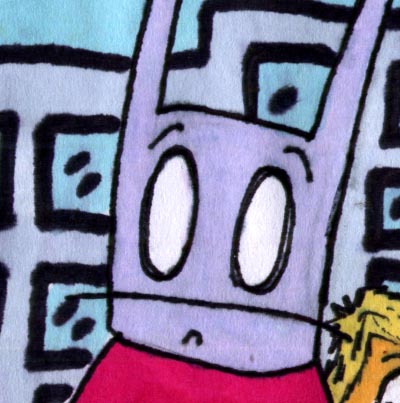
This illustration also features Simon's latest (as far as I know, unnamed) character. This pointy-eared fellow made his first appearance just a few weeks ago in an earlier post. So I think Si is still developing exactly who - or what - he is... or even how exactly he should look.

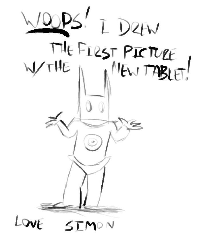
Recently (for my birthday) I got a new Intuous4 Wacom Tablet. Simon installed it for me late one night after I had gone to bed, and when I started up my iMac the next morning -- this is what I found on my desktop.

Its my favourite drawing of "the new guy" that he's done so far.

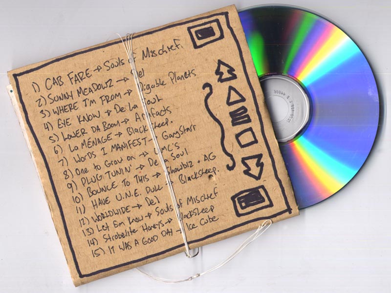
Simon's not the only artist in the family. Below is my Father's Day gift from Duncan, my older son. This is so cool... at first I thought he had bought me a new Kid Koala CD. But no - Dunc designed, illustrated and built this mix-CD cardboard case all on his own!


Were having a love affair at our house with mostly-90's hiphop these days. If you know what kind of tunes I'm talking about, you'll appreciate this playlist as much as I do. This was our soundtrack yesterday when the four of us drove out to the country for a hike and picnic.

I love my boys - they gave me the best Father's Day ever!

* Check out Duncan on bass and Simon on drums with their band, Damien Fernandez & Friends, here.

* And Duncan created this song on his Monome.

Sunday, May 31, 2009

SuperSimonSunday: Let's Fight!

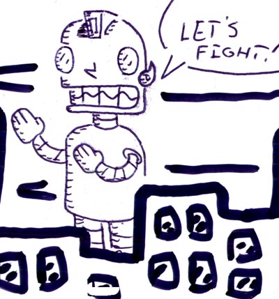
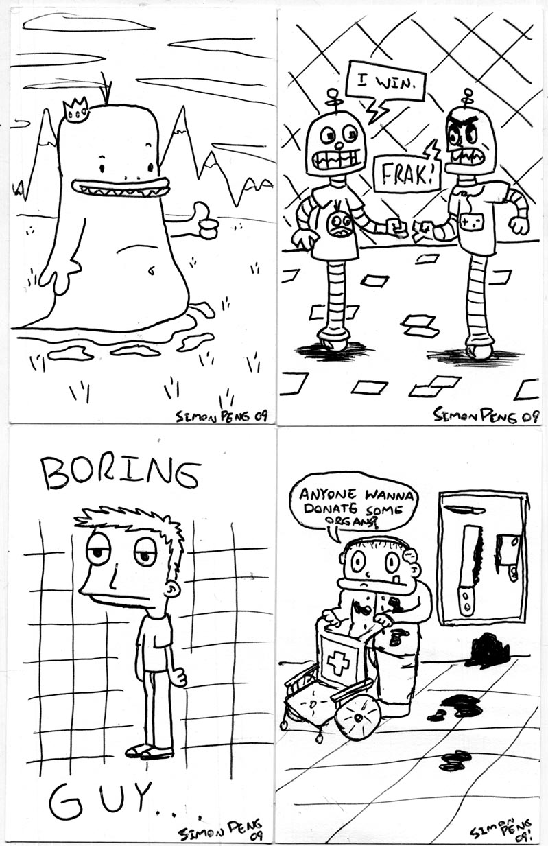
No idea why, but Simon's latest efforts revolve around some seriously bad-ass robots, just itchin' for a dust up.


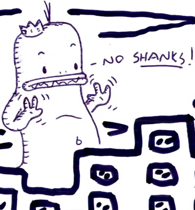
Here's the piece he proudly presented me with after coming home from work yesterday - a Giant Robot about to go 'Godzilla vs Mothra' on a giant King Flabu-Flabu.


But this is interesting... it turns out King Flabu-Flabu is a pacifist ... either that or he just doesn't like his chances against this particularly aggressive tin man...


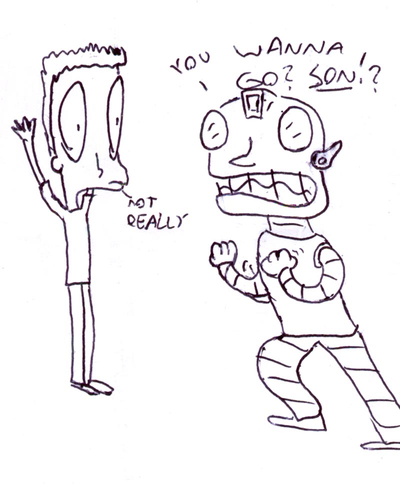
And as an afterthought, Simon showed me this variation he wasn't quite as happy with. Still pretty good though, in my books.


So whattaya say, huh? Wanna Go?! Son??!! Grrr!!!

Wednesday, May 20, 2009

SuperSimonSunday... on a Wednesday!

Its been a couple of weeks since I last posted any of Simon's cartoons. That doesn't mean he hasn't been busy creating them, though! So rather than wait until next Sunday (when I'll be away at the NCS Reubens anyway), here's his latest batch. Once again, he drew these while he was supposed to be working at his part-time job at Omi's store, the bum.


This smaller group has a couple of my favourites in it... King Flabu-Flabu, of course, but also the robots playing 'Rock/Paper/Scissors. (BSG fans will catch the swear reference). Simon's favourite is the long-eared character in the center, above.


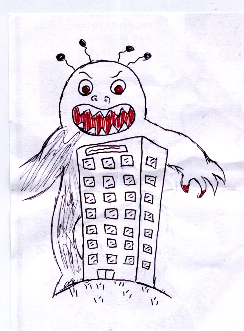
But as usual, my favourite favourite is the rejected sketch Simon hates. I love this little monster with the red accents! Simon crumpled it up, but half-heartedly showed it to me anyway. Its awesome! He thinks I'm wrong. We have a difference of opinion, as usual.


Which one's your favourite?

Sunday, April 26, 2009

SuperSimonSunday: The Awesome Test Monster!

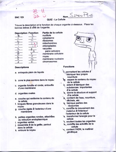
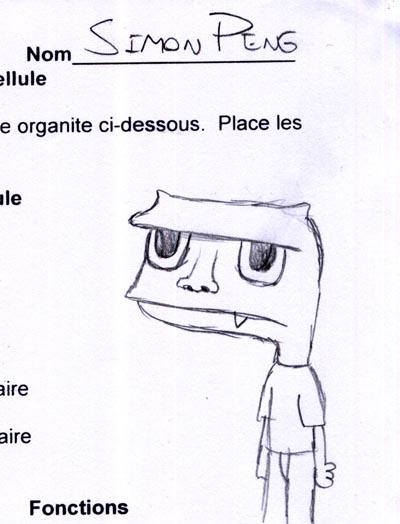
Simon brought this test home the other day and left it on the kitchen counter.


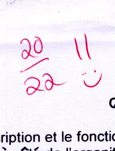
I picked it up said to Wendy, "Did you see this test Si brought home? This is awesome!" Wendy came and agreed: "Wow, Simon," she said, "that's a great mark!"


Still holding the test I turned and looked at her. "I meant the drawing of that monster. The drawing is awesome."

"You're ridiculous", she said in exasperation as she walked away.

Si came in and said, "That drawing? You like that drawing?! I didn't even like that drawing. I was thinking about erasing it!"


Simon was annoyed.


"Why do you always have to like the drawings I hate?" he demanded, stalking off in frustration.

I dunno... I think its awesome! And yes, that was a very good mark too. Great work, Si!

Drawing Drugs

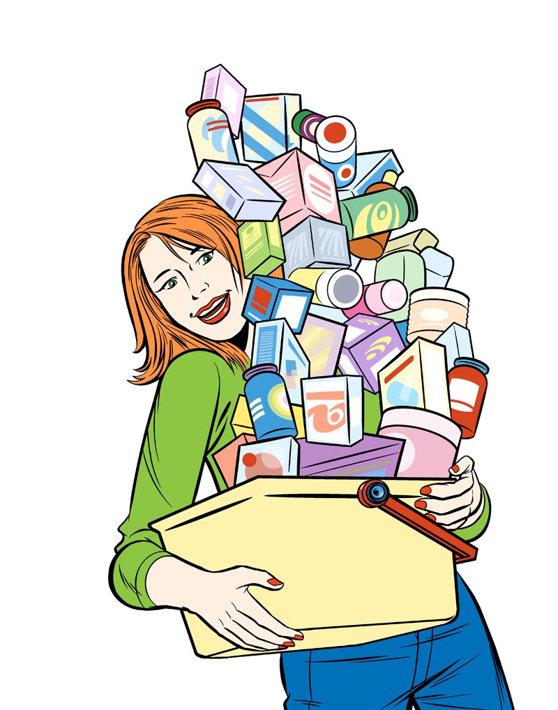
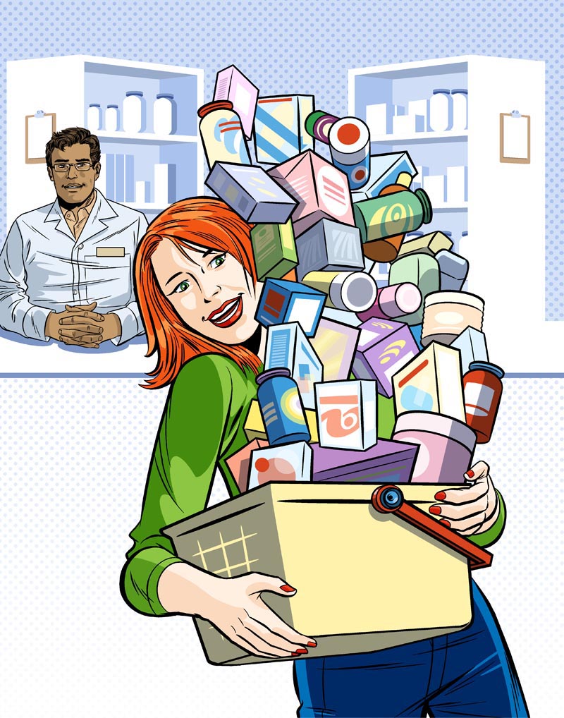
A couple of weeks ago I posted a step-by-step of a magazine cover I was working on. Well, here's a copy of the cover PDF that my wonderful art director Linda sent over! Linda was amazing to work with - very enthusiastic and open to my suggestions. What a pleasure it was collaborating on these visuals with her!


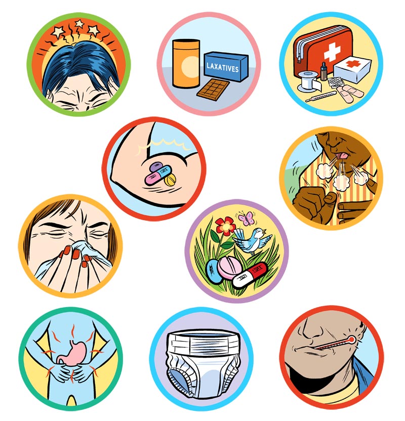
As well as the cover, we did two interior spots and ten small icons which Linda planned to use to break up columns of mostly grey type. Drugstore Canada is a trade magazine, meaning a relatively tight budget, and that was quite a lot of artwork for the money. But I didn't want to pass up such a fun project (and really, in this economy, who can afford to turn away work?)


Happily, Linda was open to suggestions and by putting our heads together we came up with some creative solutions and figured out ways to re-use elements for different purposes, cutting down on the total amount of artwork that needed to be created.


So for instance, notice how the column icons have found a second life as a conceptual way of illustrating that the heroic pharmacist has a multitude of solutions to your health problems literally "at his fingertips".

And, if you scroll back to the top and take a closer look at the cover, you'll see how the pharmacist artwork plays a supporting role in the background, again eliminating the need to create a new piece of art.


This was accomplished by carefully planning ahead and then executing the artwork of his many "ghost hands" on various layers. That way, when it came time to add him to the cover, I just turned off the layers with the extra hands and dragged and dropped him into the cover artwork.

I'm delighted with how this project turned out - and I hope Linda was as well. I'm proud to add the cover to my collection of Magazine Cover Art by Me Flickr set. Not just because I love how the art turned out, but because Linda's excellent design of the type elements makes this cover a real showpiece. The interior art joins other work in my Editorial Art by Me Flickr set

Thanks to Linda for giving me a chance to shine on this great assignment!

Sunday, April 12, 2009

SuperSimonSunday: King Flabu-Flabu

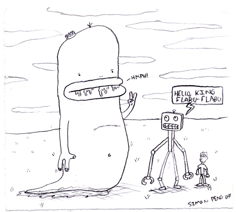
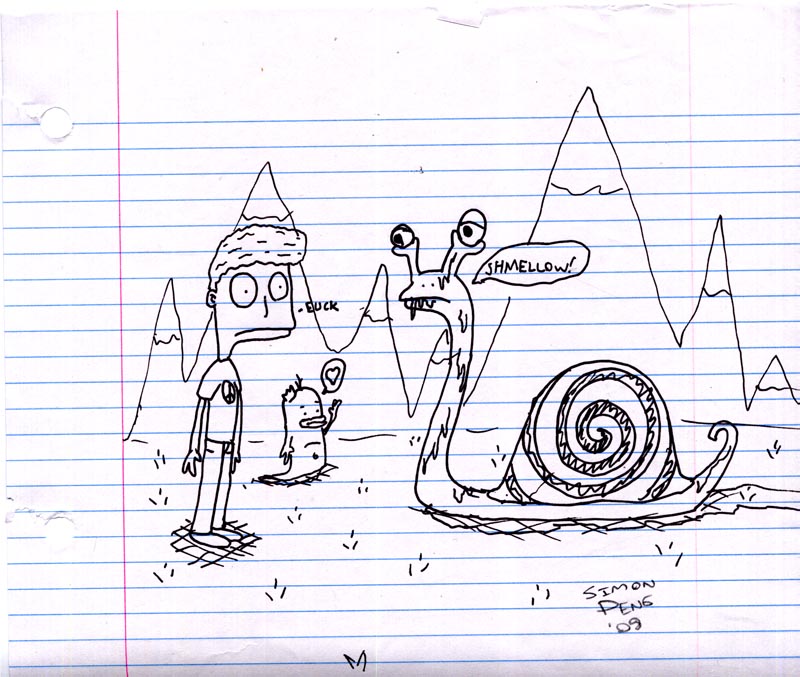
Simon's has created a few on-going characters over the years... characters which appear again and again in his drawings over a long period of time. One of his most enduring creations is the little guy on the far-right of the drawing below: 'King Flabu-Flabu'.


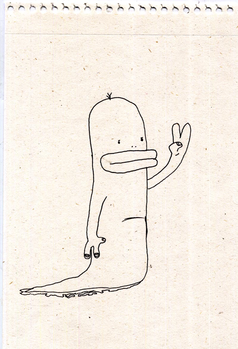
Simon tells me he has been drawing KF-F since he was in Grade 6, when he was 11. He says he was playing 'The Legend of Zelda' at the time on the N64 and that there's a level where Link is inside Lord Jabu-Jabu, and that's how he came up with the name "King Flabu-Flabu". I thought this drawing below might be an early incarnation of King Flabu-Flabu because he doesn't have a crown and there's no drool on his lips. As well, he's more elongated than in later drawings, but Simon says that KF-F always had a crown right from the start. He figures he just forgot in this case.


Here's a KF-F drawing from 2007. Simon was 12 at this time. Notice the drool on KF-F's lips. Those big drooly lips were the crux of the character's creation. Simon invented King Flabu-Flabu because he wanted to draw a character with big drooly lips.


Last year Simon spent 'Take your Kid to Work' Day in Wendy's Grade 4/5 class. He taught all those little kids how to draw King Flabu-Flabu ... and even now, a year later, its not that uncommon to see KF-F drawings being done by those same kids! I think that's pretty remarkable. Si really made a big impression on those kids!

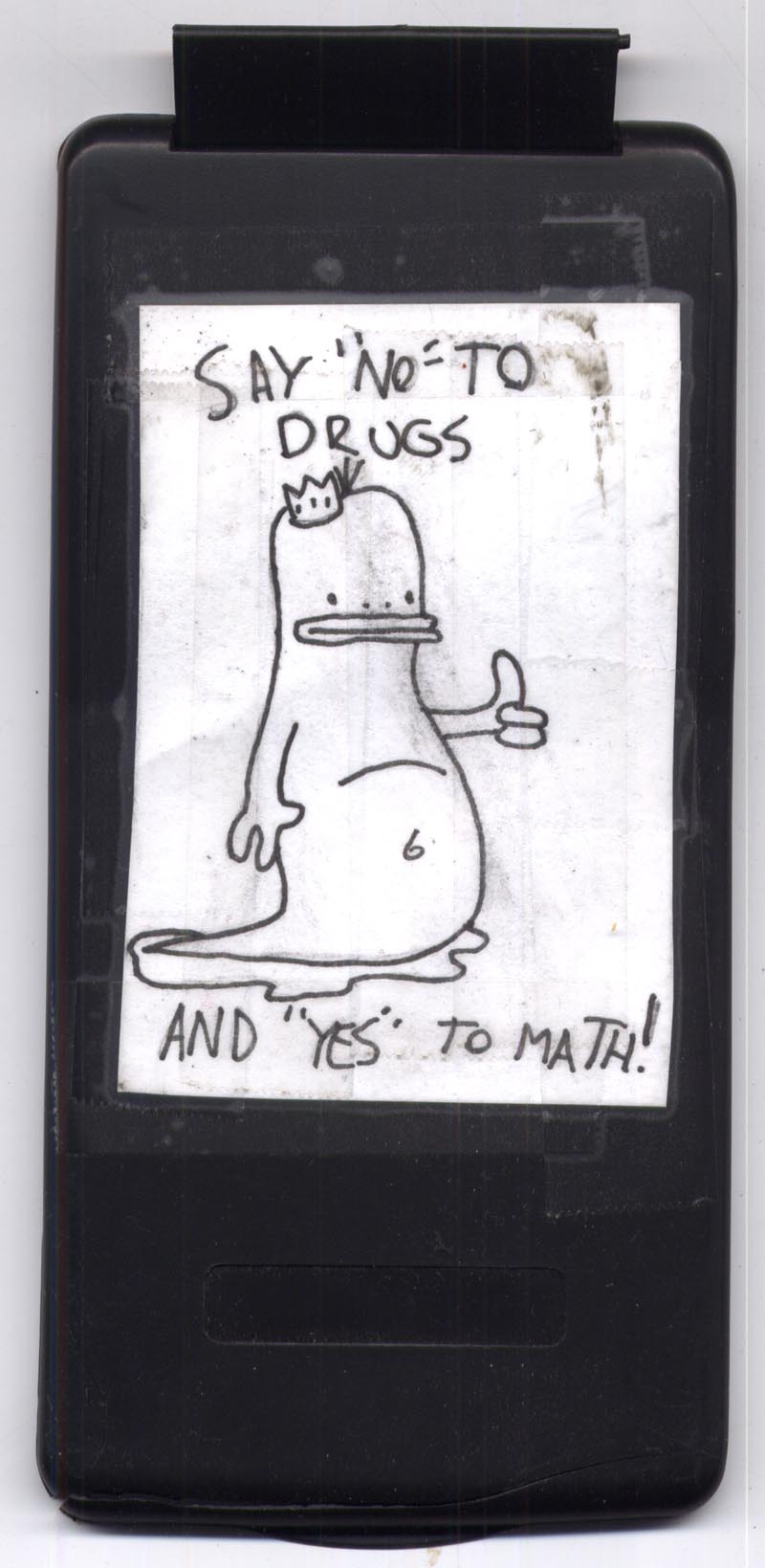
Below, the back panel of Si's calculator.


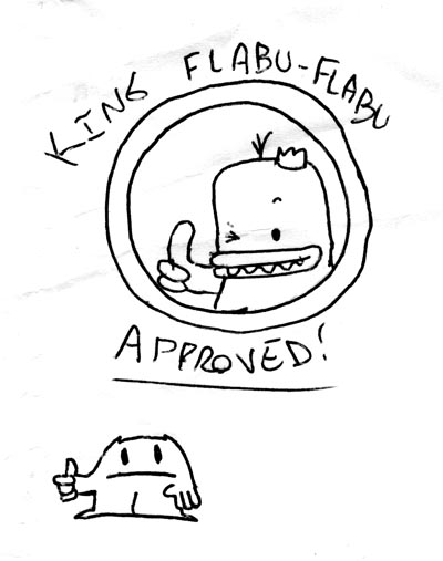
Below, a much more recent drawing from this year. KF-F has become shorter and cuter over time, and if he appears at all in Simon's work it is usually only in a supporting role.


I get the impression Simon has moved on from King Flabu-Flabu, although he insists he has not grown bored with the character. I guess time will tell. But what I find kind of amazing is that Si developed such a consistent and fully-realized character while in middle-school. I never had that kind of focus when I was his age, that's for sure!

Who knows what might become of KF-F? One day we may see him starring in his own video game or animated cartoon series...


Just in case, I better make a point of saying "King Flabu-Flabu is © 2009 by Simon Peng". After all, I have my retirement to think of!

Saturday, April 04, 2009

A Magazine Cover in Progress

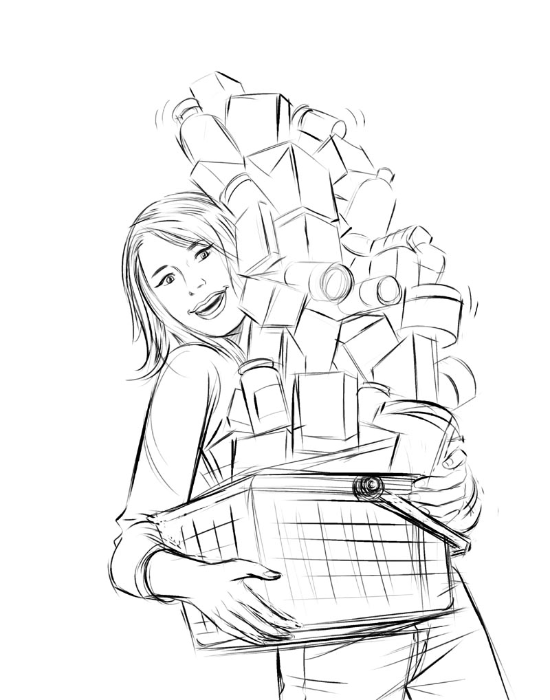
I'm having a lot of fun working on this magazine cover. Thought I'd share it with you as I go along. Here's the pencil sketch, done with the Chalk Pastel tool in Corel Painter.


Now with the sketch on a transparent layer, I begin inking in Painter with the Fine Round Gouache Brush tool. I used to use the Scratchboard Tool to mimic the sweeping lines of a sable brush and india ink, but my pal René Milot turned me on to the Fine Round Gouache Brush tool. Thanks René.


... and, for mechanical objects, the Pencil Tool in Photoshop. By "mechanical" I mean not just the boxes and bottles, but anything that needs a precise linear or circular (or elliptical) shape - like the woman's eyes, for instance.


Have to get this done this weekend - so drop by later for more! ;^)

Tuesday Morning Update:

Well, things didn't work out as planned, schedule-wise. I got - not one - but two storyboard jobs in over the weekend. But now I'm back at it!

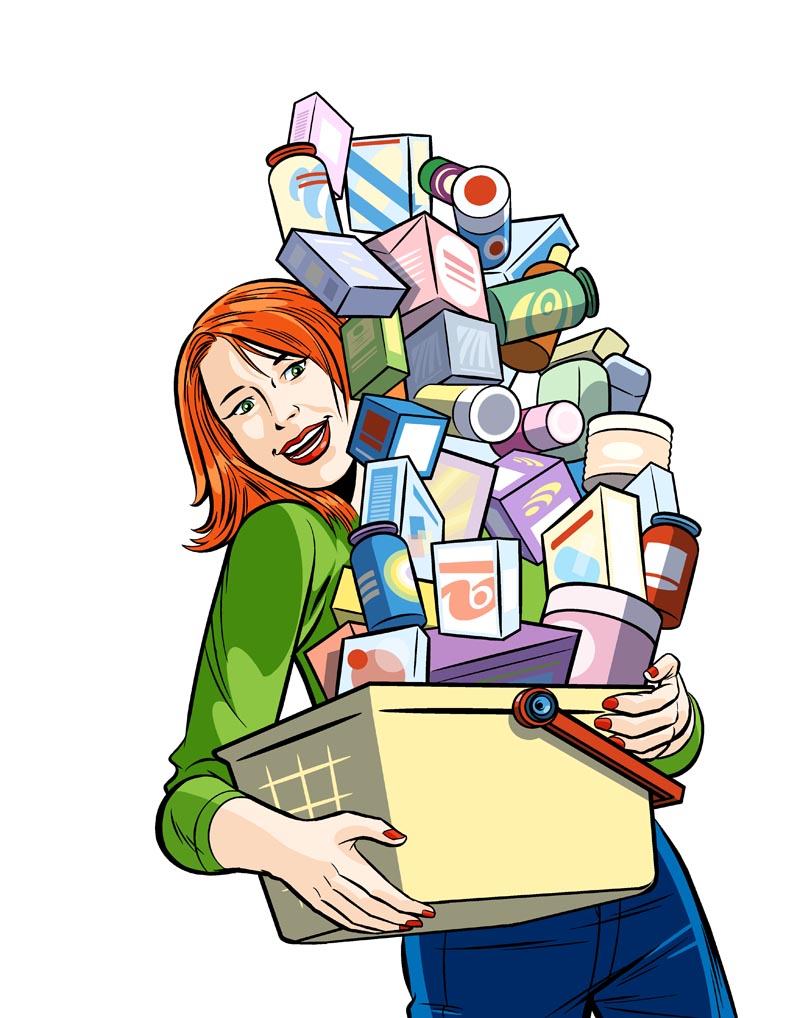
After finishing the inks, I began flat colouring in Photoshop by using the Polygon Lasso Tool and Bucket Fills. The labels were created with a combination of Lasso and Pencil Tool. Those labels took a very long time. Most of one day, in fact.


Shading was added on a multiply layer, mostly with the Pencil Tool but I did use the Path Tool for the facial shadows.


This part's done and sent away to the client... now I'm working on the background elements... so stay tuned!

Later that evening...

Finished! Well, just about. There may still be some tweaks here and there, but this is essentially it. The background took most of the afternoon to do. Because the cover girl's final position was uncertain, I had to make sure the background art was done all the way across.

So there's a lot of little bottles and boxes on those shelves that will probably never be seen. But they had to be drawn anyway.


Our man behind the counter is going to be making a guest appearance inside the magazine as a spot illo (with some interesting modifications). I might post that later. Maybe tomorrow. For now, I still have ten little icon-type illos to do for this job!

Sunday, March 22, 2009

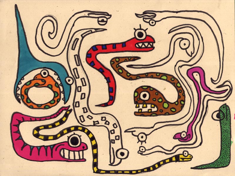
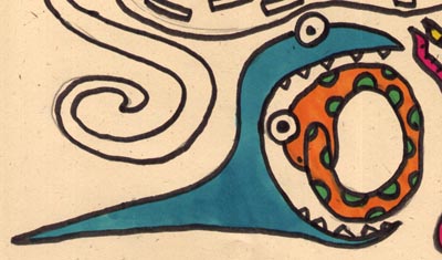
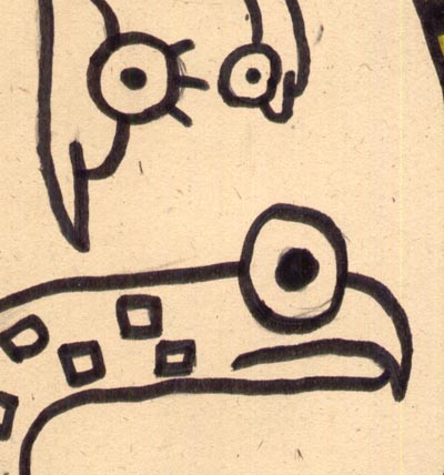
SuperSimonSunday: SNAKES!

Here's something Si got into a few months ago. He did a few of these amazing pages of snakes!


Some of these really blow me away. This happy couple is my favourite.


But I love all the variations he achieved with what is really a very basic premise for a character: a profile view of a tube with an eyeball and a mouth.


I was hoping Si would finish colouring this piece... but he got bored and moved on.


It makes me sad!

Sunday, March 15, 2009

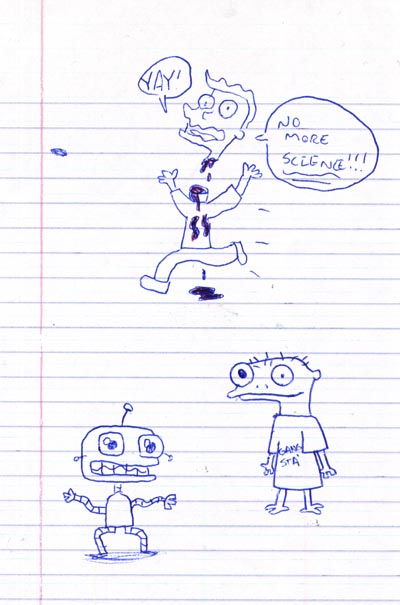
Super Simon *Schoolbook* Sunday

When I was picking out what to scan for Super Simon Sunday a few weeks ago, Si casually mentioned that the best stuff wasn't even in his sketchbooks -- it was the stuff he doodled in his school notebooks. No kidding!


So I snuck one of his binders out of his knapsack and bingo! Paydirt!


Here are just a few of the brilliant drawings my little genius did when he should have been paying attention in class. God love him... he's definitely an artist.


So he caught me while I was scanning these. "What th'-! You're going through my stuff?!" Yes, I'm going through your stuff... you said that this was where the good stuff was and you weren't kidding.

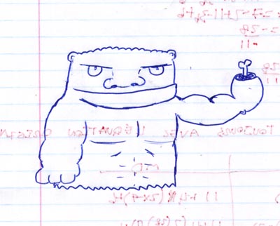
For the record, Si says he hates this drawing below, but I think its awesome. If you agree... leave a comment and let him know!
Thursday, March 12, 2009

From Mary Blair >>to Paige Pooler >>to Me!

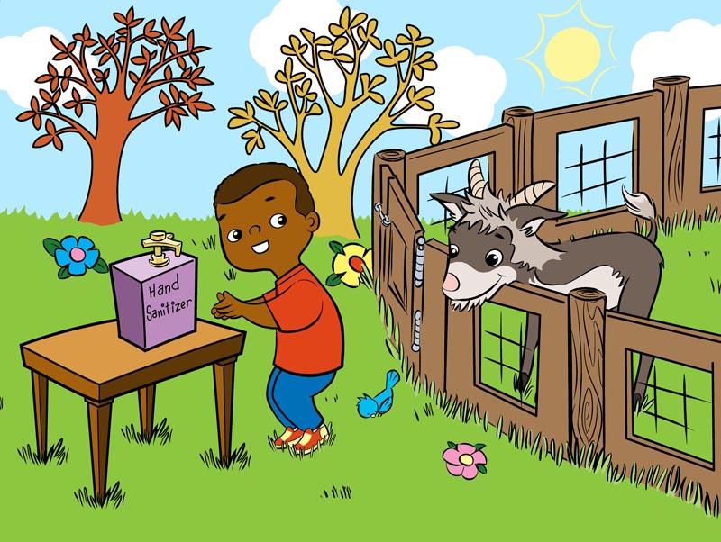
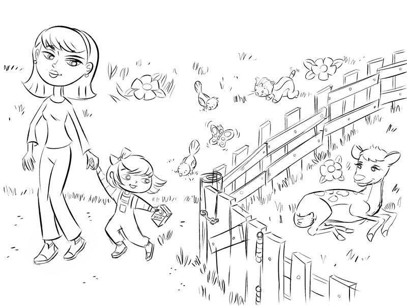
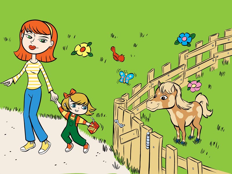
Here are two hand washing safety posters I did last month for a client in Toronto. These are intended for use in kindergarten classrooms. Black and white versions that kids can colour will also be distributed.


Notice how they changed from the sketch stage to the final.


My initial inspiration for these was Mary Blair... but I must tip my hat to the amazing Paige Pooler, who's work always inspires me when I have to do cutey-pie artwork.

I get a little frustrated with what seem like arbitrary client changes...


... like the simplifying of the table legs and lettering on the hand sanitizer bottle. Why? I thought those touches added some charm. And they didn't understand my stylized sun "rays" (which I lifted from an old 1950's Golden Book).


... but that's the ad biz for ya!

* More colour book-type art by me.
Sunday, March 08, 2009

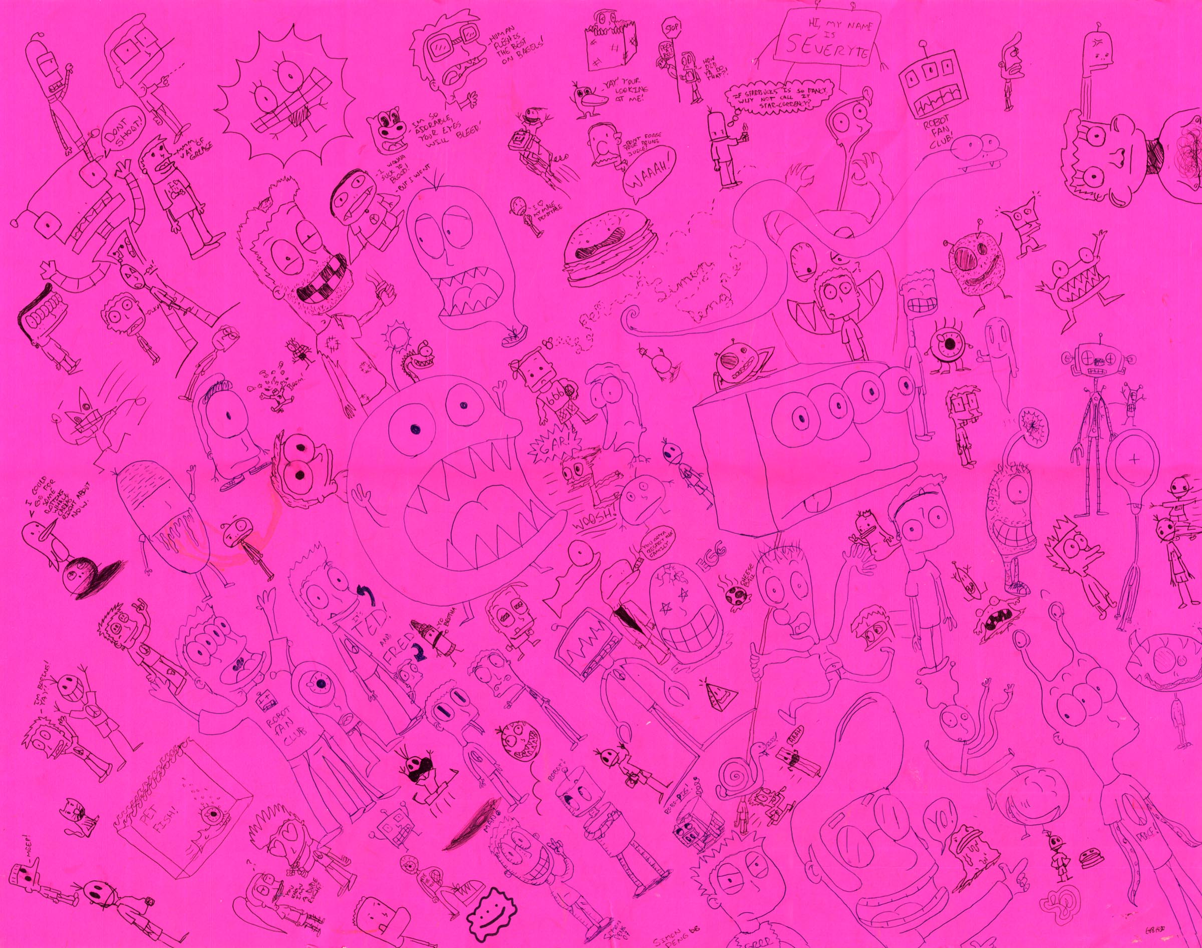
SuperSimonSunday: BIG PINK DOODLE SHEET!!!

One day Simon brought this home... a massive fluorescent pink sheet of bristol board - 22 by 28 inches - covered in tiny doodles!


Turns out he'd been working on it off and on for about a year down in the basement of my mom's gift boutique, where Simon works part-time on Saturday mornings. Yeah - while he's being paid by his Omi to work for her, this is what he does!

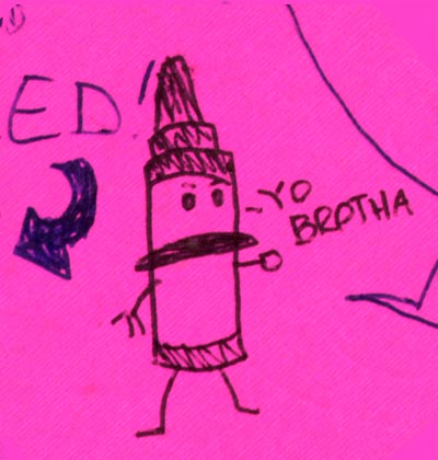
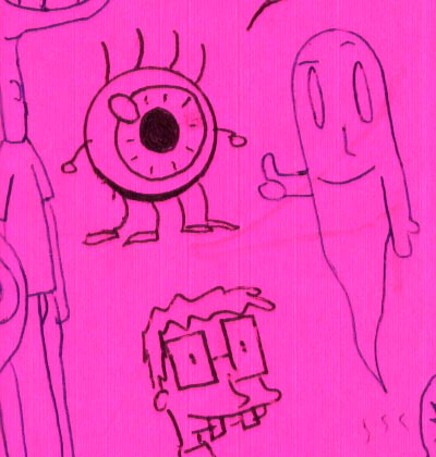
Clicking on the image above and spend some time enjoying all the crazy characters... I pulled out a few of my favourites... tell us which ones you like best!


Saturday, March 07, 2009

The End of an Era?

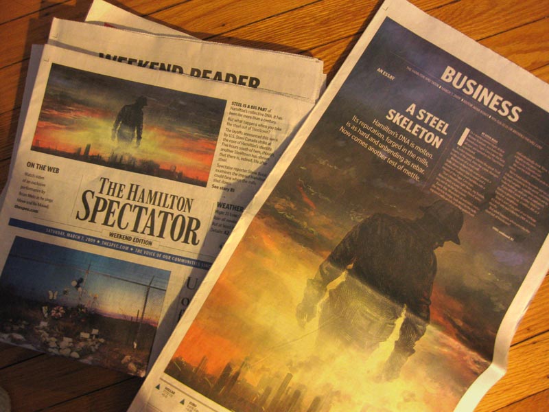
U.S. Steel purchased our iconic hometown steel company, Stelco, just about a year ago. This week they announced they are shutting it down because of the current world financial crisis. In a hundred years, Stelco's furnaces have never stopped running, not even during the Great Depression. 2,000 people will lose their jobs.


My friend Aviva Boxer, Business Editor at our local paper, The Hamilton Spectator, commissioned me to do this piece at the time of the takeover. Steel has always been the foundation of industry in Hamilton -- and a point of pride for Hamiltonians that it was a Canadian-owned and operated business. When the steel industry went through a consolidation in recent years, reducing it to just a few world-wide players, it became inevitable that we would be bought out by foreign owners. It seemed like the end of an era. For reasons I'm not really sure of, the illustration was never used... but now, with the shutdown of the mill, it really is particularly poignant.


I'm glad this piece is finally seeing print... I just wish it weren't under such unfortunate circumstances.

You can read the related Hamilton Spectator article here.
The whole thing was done in Corel Painter. The figure was rendered using the scratchboard rake tool.


* More examples of my editorial artwork here.