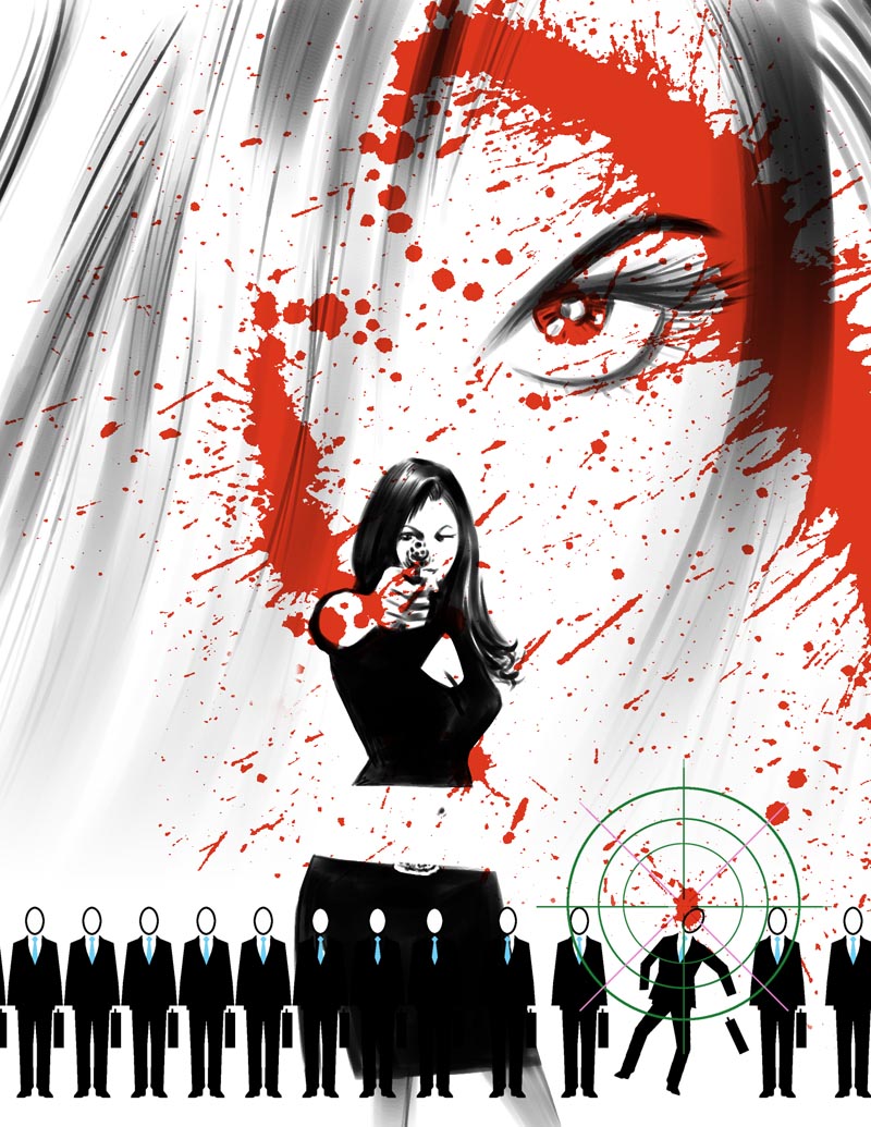
I found some reference of a girl pointing a gun on Flickr and used that as the basis for my illustration. I'm going to send the Flickr member a link to this post - I hope she likes the way I used her photos for inspiration to create this IF piece!

This really was a fun one to work on... but I wish I had more time to explore the design further. Maybe I'll try out some variations on the weekend!
6 comments:
Looks good :)
Hey thanks buddy!
Love it! Simply love it.
Thanks HV :^)
I really enjoy this piece. How did you create the effect of the blood splattering? It looks so real!
Thanks Ken. Didn't I explain that in class? Its an actual splatter I made with india ink on paper, then scanned in and coloured it red, then added on a transparent layer.
Post a Comment