This semester I'm teaching a course called "Promotional Illustrations," something I'm very familiar with.
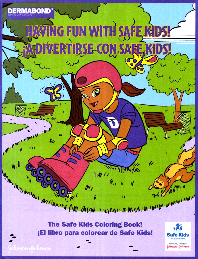 |
| Dermabond promotional colouring book |
Doing illustrations - both concept and finished art - related to the promotion of products or services has always been a major component of my work.
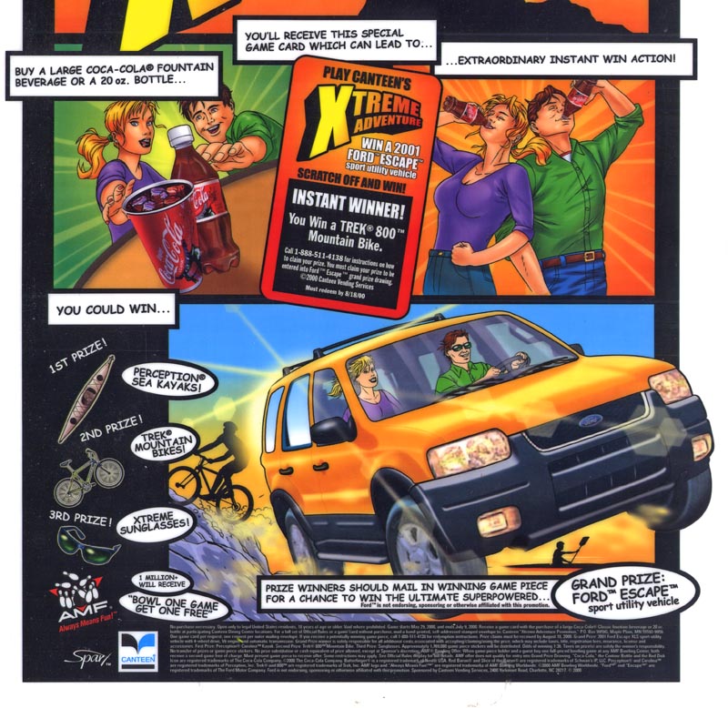 |
| Coke contest counter card |
For the benefit of my class ( and for anyone else who might be interested ) I thought I'd show a few of the projects that have passed across my drawing board in the last 20 years.
Promotional Concept Illustrations
As a storyboard/concept/layout artist, I'm often called upon to draw up ideas generated by art directors at marketing and promotions companies. Now, unlike the assignments my students are working on, I can't take any credit for coming up with these concepts. The ADs who hired me did the (often clever, sometimes not) thinking and called upon me to visualize what their concept would look like for the purpose of presenting it to their client.
Sometimes the artwork is about as close to utilitarian as you can imagine. These drawings for a South Park poster dump bin...
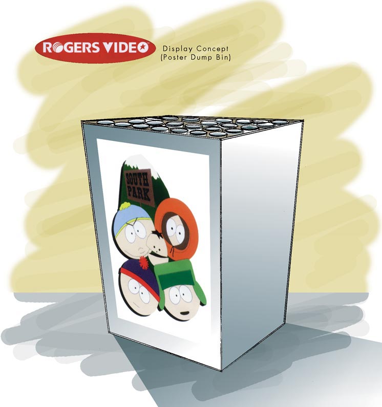
... and for a video store end-aisle merchandiser...
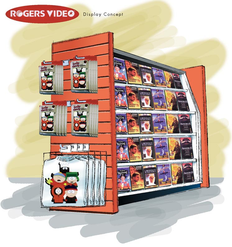
... are intended to do nothing more than explain to the video chain store's executives what their store would look like with South Park merchandise in it.
Yes, business people are sometime so visually inept that they need something this obvious to 'get it'!
Here's another concept illustration for an in-store promotion -- this time for Absolut Mango Vodka. Here the promo concept is much more clever: the AD proposes that the grocery store chain replace their regular hanging weigh scales near the fresh fruit section (where the mangos would be kept, right?) with weigh scales shaped like a silhouette of an Absolut Vodka bottle. Clever.
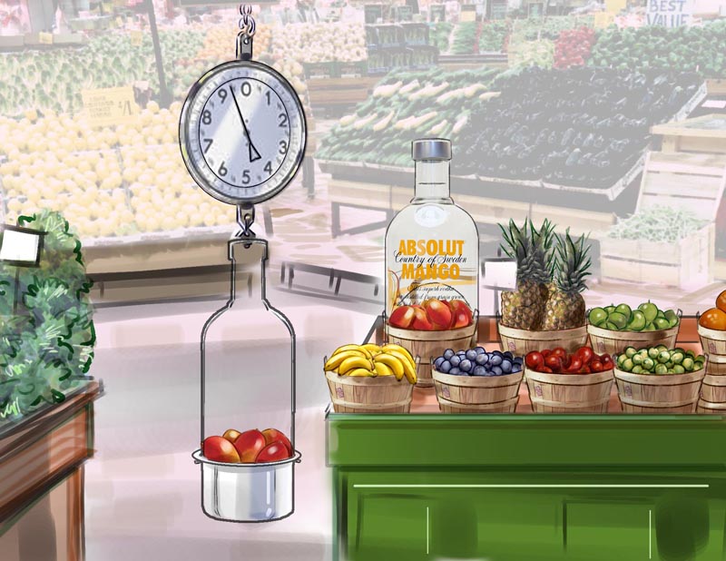
And to compliment the promotion, he devised an oversized plastic "dome" shaped like an Absolute bottle to be placed over the mangos, with an oval 'doorway' cut into it so you can reach in and grab a mango. Nice!
Because this was ( as usual ) needed at double-quick speed, I used some found photography as a background element for the drawing. You wouldn't be able to do this if you were producing finished art for publication, but in the hyper-fast paced world of advertising presentation art, you use whatever trick will get a decent looking visual to the client meeting on deadline!
Below, a few fun Absolut Mango promo items the AD asked me to visualize for him: a shrink-wrapped mango pit ready for planting (instructions on the mango tree-shaped hang tag), a mango-shaped bar coaster, and a couple of those little gel caps you put in water that grow something after 24 hours, in this case, a mango tree or an actual mango.
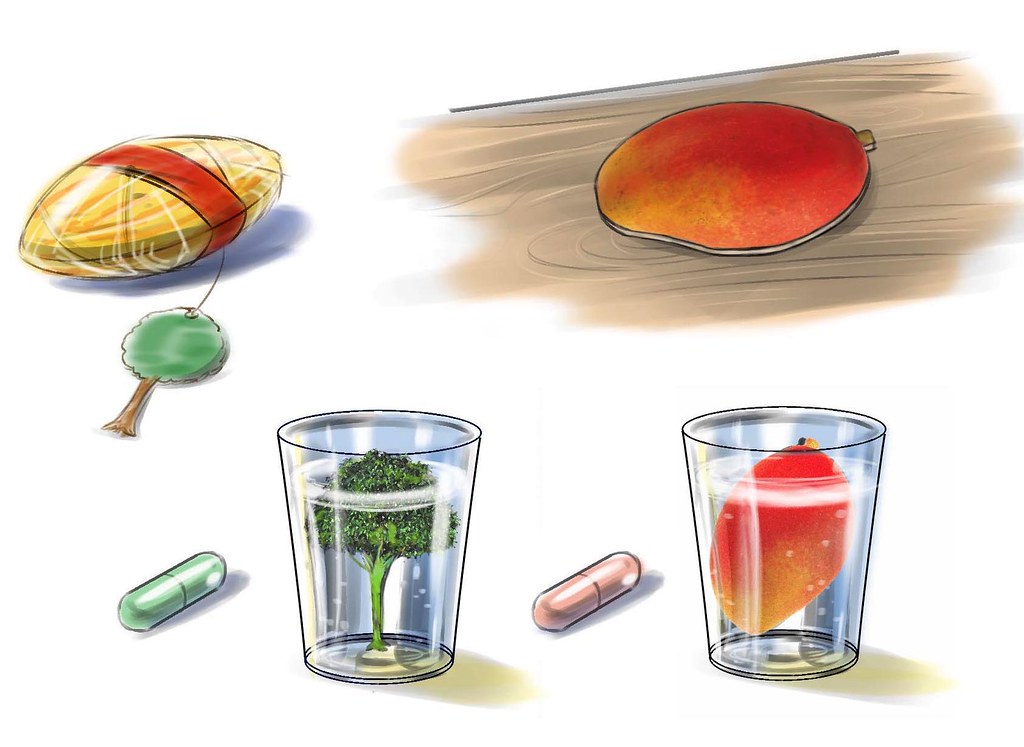
All these items would have been branded with Absolut Mango Vodka logos before being presented at the client meeting, of course.
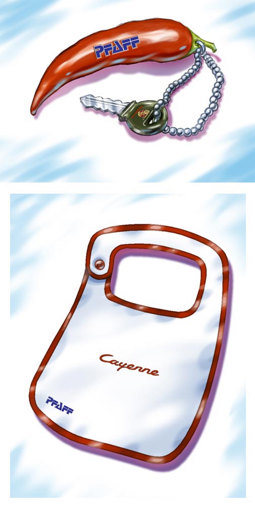
Next up, a couple of promotional merchandise ideas for the launch of the Porche Cayenne. The keychain in the shape of a cayenne pepper seems like a natural...
 |
Below, some promo merch concepts for Molson's. This stuff wasn't even for public consumption - this promo was intended for a weekend getaway at a Mexican resort for beer reps!
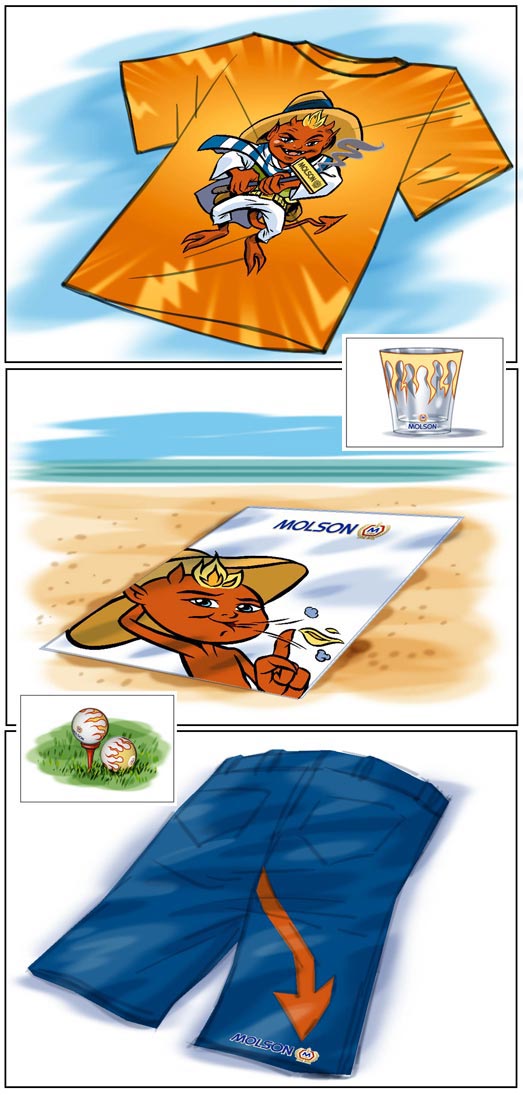 |
(Incidentally, I was also commissioned to design the little devil mascot that appeared throughout this promo)
And finally, some drawings for a promo "event marketing" concept: a mobile Carlberg beer garden.

The idea here is that you put a bar in a trailer and pull it to various festivals and outdoor events. Everything folds right out and - voila! - instant bar!
(Again, keep in mind that these illustrations would have been branded with Carlsberg logos before the agency showed them to the client. The reason you don't see that in these drawings is because the art director said he'd take care of it in-house)
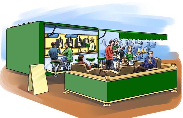
Also, remember that all of the drawings above are "concept drawings" only - never to be published - only for client meeting presentation, and thus not required to be finished to the same degree as artwork that would actually be viewed by the consumer market.
Some examples of the promotional illustrations I've done that were ultimately printed are coming up just below...
Promotional Finished Art Illustrations
Flyers, coupons, P.O.P. material, promo t-shirts; they all need visuals to help the client promote their goods or services. Sometimes those visuals are photography or graphics ( like logos and such ) - but in many cases the ideal visual will be an illustration. Over the years I've done more promotional illustrations than I can possibly recall.
Below, an illustration for Heinz ketchup that was used for an in-store backer card, if I remember correctly. From the looks of that cartridge Mario is holding, many of you who were avid gamers while growing up will appreciate that this piece was done a loooong time ago! Unfortunately I rarely get printed samples from my clients once I've delivered the art so I don't have any type elements to remind me what the heck this was for. A contest to win a free Super Mario game, I think...

Here's another backer card, this time for a Nestle's Quik promo where you got a free glass with purchase (the glass would have had some Quik Bunny artwork on it before this went to the printer)...
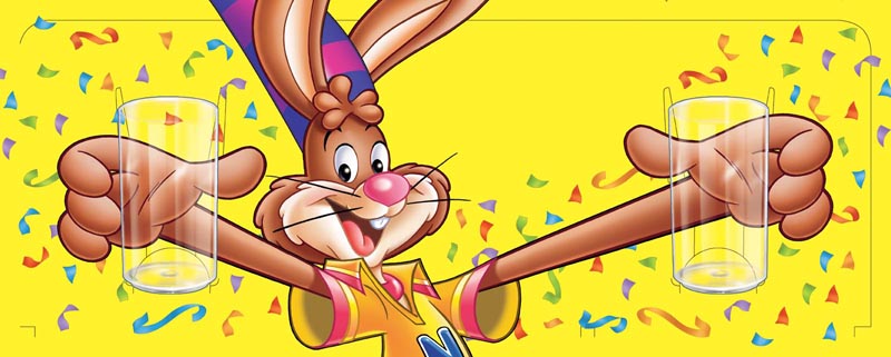
This is a good example of the important role illustration can play in the promotion of a product. Even though photography could have been used for the image of the clear glasses in the bunny's hands, the client wanted to retain an element of "illustrative realism" to connect the glass more effectively with the bunny.
And yet another Nestle's Quik promotion: three on-pack Quik Bunny comics I produced for a marketing and promotions company back in the 1990s.
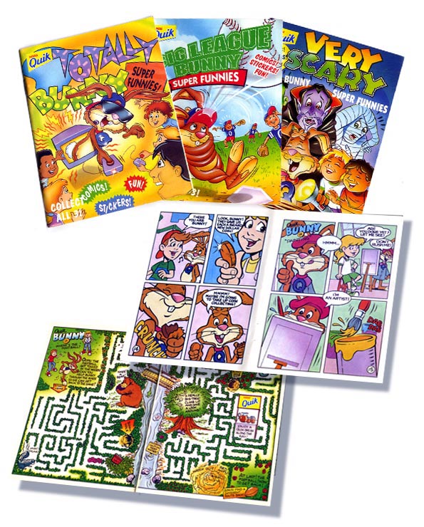 |
These were digest-sized comics/activity booklets shrink-wrapped right onto boxes of Nestle's Quik chocolate powder ("Collect all three!")
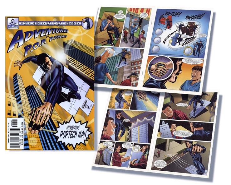
Promotional comics have been popular for most of the last hundred years - and over the last twenty years, I've done quite a few for advertising clients and charitable organizations.
Promotional comics have been popular for most of the last hundred years - and over the last twenty years, I've done quite a few for advertising clients and charitable organizations.
 |
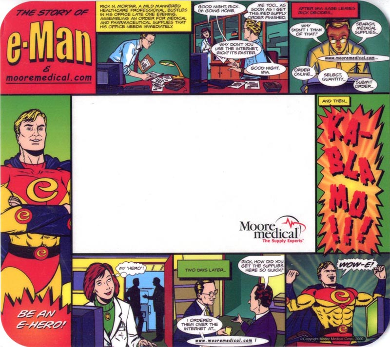
Similarly, the mouse pad below was created for a pharmaceutical company and used as a "B-2-B" promotional item.
Here's another backer card that was used for an in-store display, this time for Lay's.

And at last, a printed sample! A tent card for Campbell's Soup with all the type elements in place.

Incidentally, I also did the character design for these veggies, which were turned into plush toys for the purpose of the promotion.
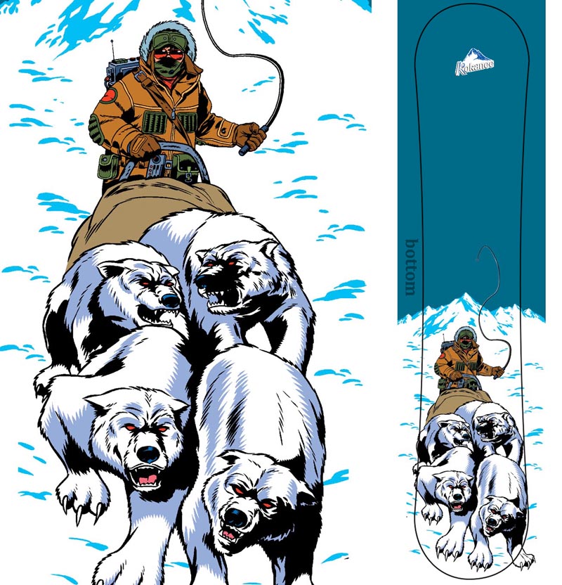
And finally, one of the most unique promo's I've ever had the privilege of working on: a limited edition Kokanee beer snowboard that was given away as the prize in a promotional contest.
Hope you enjoyed these examples and I hope they gave you some ideas for your assignments. Feel free to leave comments or ask questions!

Here's another backer card that was used for an in-store display, this time for Lay's.

And at last, a printed sample! A tent card for Campbell's Soup with all the type elements in place.

Incidentally, I also did the character design for these veggies, which were turned into plush toys for the purpose of the promotion.
And finally, one of the most unique promo's I've ever had the privilege of working on: a limited edition Kokanee beer snowboard that was given away as the prize in a promotional contest.
 |
| The bottom... |
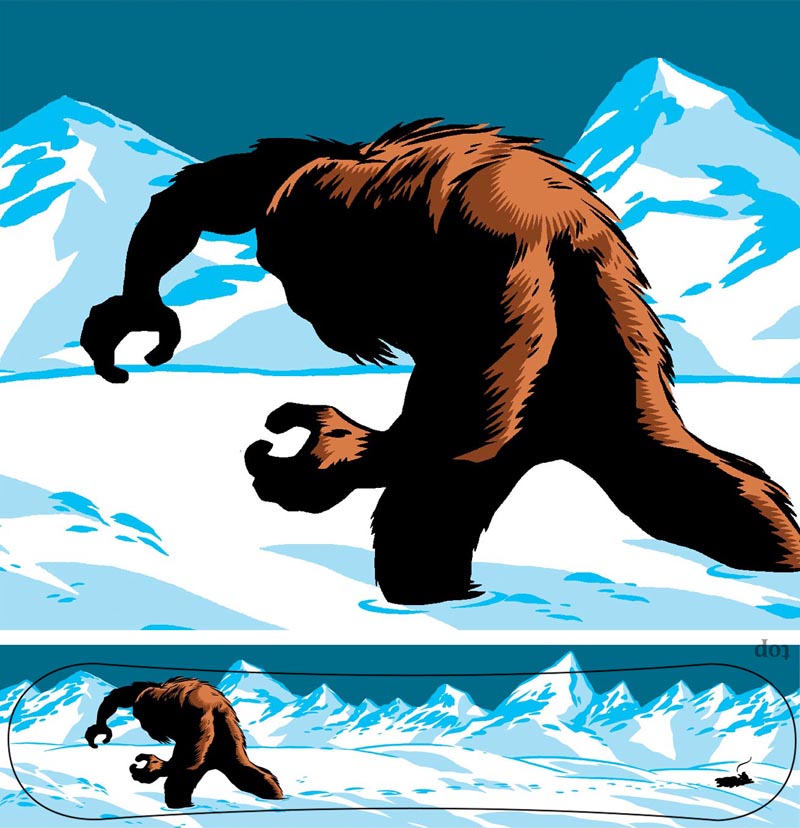 |
| ...and the top. |
No comments:
Post a Comment