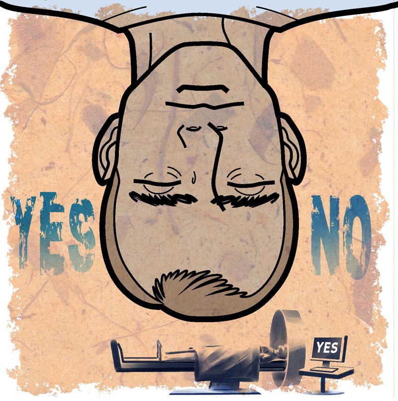
These first few are my favourites because I was able to devise these sort of interesting contrasting visual elements of the 'infographic' style juxtaposed with the more painterly style of the small figures. In retrospect, I wish I'd used this devise throughout the entire series, but "them's the breaks" when you're cranking stuff out at speed, I guess...
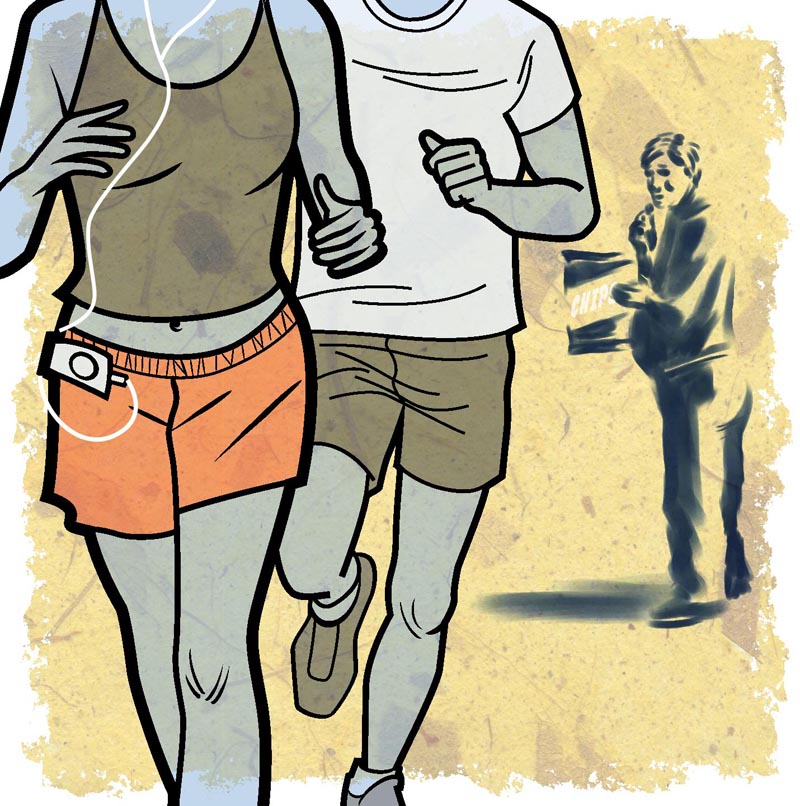

One thing I am really happy about is the handmade paper background element I used throughout. I think it works well as a nice unifying visual device - and is a little more interesting than the typical flat colour treatment you see in most infographics. I felt that by adding something 'organic' to the mix it would balance images that otherwise could end up with a very cold, technical look because of the the line art style.
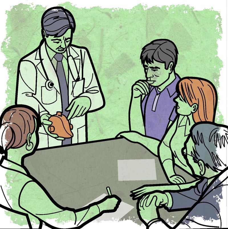
Yeah, I know this one looks very odd. Apparently doctors are using honey to treat burns. Go figure!

All of these were printed at about 3" by 3", in case you're wondering. Not too small, but small enough to best be served by a simple style, which is why the AD asked for this bold line style I used.
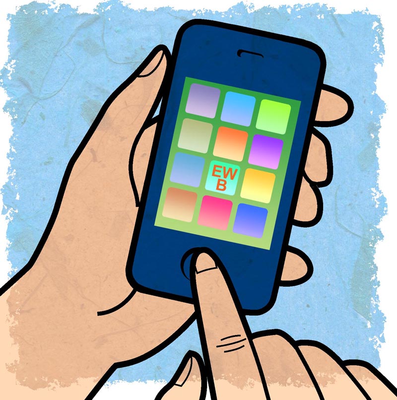
This last one with the six-pack was added late in the game and without any concept sketch from me - just a quick email describing what was wanted. Because of the subject matter it feels to me a bit out of place with the rest of the spots, but I did like how it turned out.
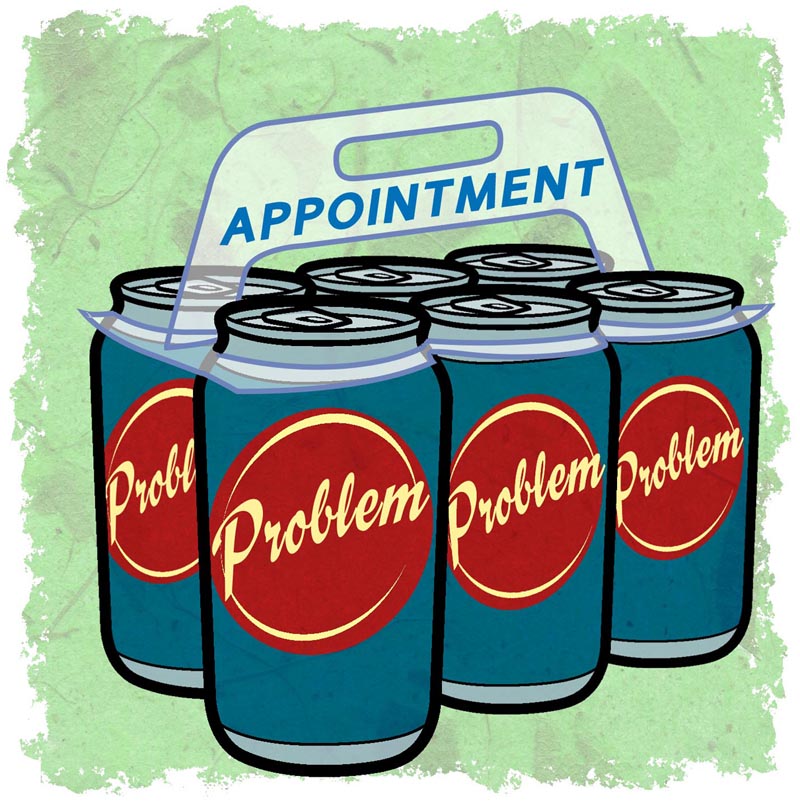
So there you have it -- seven spots for the Medical Post!
2 comments:
great work Leif! dig the style
Thanks Greg - I appreciate it :^)
I've been doing a lot of finished art in this 'infographic' style lately... I did a whole bunch of stuff for a textbook publisher recently which I'll try to post some time soon.
Post a Comment