First I just want to mention, if you are a fan of illustration from the fifties, be sure to check out my other blog, Today's Inspiration, and please feel free to comment.
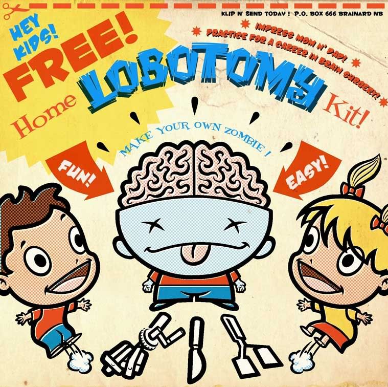
The piece I did here this week for I-Fri was very much inspired by the amazing work of Candy Killer artist, Brian Taylor. I just received the book version of his website and its fantastic! If you ever saw Art Spiegelman's "RAW" magazine, this guy would have fit in there like a dirty shirt.
I used to go crazy for this kind of faux-retro cartoon style back in art school when a guy named Lou Brooks was just making the scene. He was a huge inspiration to me. The first few years in the business, I used to snap up every promo piece Brooks put out. He proved to me that you could work in a cartoon and comic style in the "legitimate" illustration field.
Once again this week, I put Painter to the test, as I try to learn more about this program's capabilities. All the line art was done in Painter, first in pencil and then in ink - then coloured in Photoshop. I used Photoshop's halftone filter for the dot patterns, and the background texture is a scan of the inside cover of an old Dennis the menace Pocket Full O' Fun digest comic I bought at a used bookstore probably almost thirty years ago. For some reason they never printed anything on the inside of those digest covers...
Oh yeah! And just about all the fonts used are free downloads from FontDiner.com - with my thanks!
18 comments:
Great colors on that one Leif, cool. Are you used to Painter or is it hard? How many hours before I can make something good in it?
Hey thx CT! I'm slowly but surely finding my way around Painter - once described by my buddy Dan as "your old weird uncle" of software programs. There are tutorials but I just dove in and got my hands dirty and called 911 when it looked like I was getting in over my neck - no hours before - you can make good sh*t happen with your first brush stroke.
Hhahhahahaaaaaa! Excellent idea ...
Awesome!! I love the style and satire. Sign me up for one please.
Well Leif-this is fun in a twisted sort of way. Thanks for the giggle. And yes fontdiner.com is the best. Another great font site is-girlswhowearglasses.com
To get back to this masterpiece of funny-the part that says "make your own zombie" is a nice touch. Does that mean he does all those dreaded chores and stuff? Walk the dog even? I also thought of Happy Fun Ball from SNL & Log from Ren and Stimpy. Love this kind of humour. Cheers!
DING! DING! DING! We have a WINNER! You get the blue ribbon this week! Great piece! I heard Lou Brooks speak to an art group here many years ago. At that time he was creating his stuff by hand. People had told him to use a computer, but at that point he couldn't do it. Didn't like it for some reason.
So... I have only played around with Photoshop so far... why is Painter better or more useful than Photoshop?
PS... I like the little detail of off registration of the colors on the kids... great!
I love this style of art (what I wanted to do for my "Strength" offering--alas, I don't yet have the skills), but this is just too over the top. I love it!! Reminds me some of Juxtapose. Your other blog is pretty cool as well. The Post did have some great art. Thanks.
Gee, thanx guys for all your kind words and enthusiasm! Yes, Holly, your zombie can be controlled to do chores and homework... I suggest practicing on your little brother. Jonesy that's so cool that you met Lou Brooks - he has been my idol for 2 decades now. Urban, that's a huge compliment - I love Juxtapose and the artists therein are always a huge inspiration for me!
Hi there, thanx for your cool comments, after all there just merely drawings...
The kids are great, but the subject is even better,
would be a great idea for some people i know ( i keep the names for myself, you never know who is listening) Now i am going to have a look at your other work. i'll be around
Haha Great piece!!
I too love the colours!
Yikes! You really did capture that retro look with the colors and fonts...and what a really strange concept. Yeah...I'll be lining up to get my lobotomy:>>> Good job!
This is just a fantastic drawing! Love it! And thanks for the nice comment on my site :)
hahaha that's fabulous. thanks for the comment... your stuff is really awesome!
hahaha this is fabulous
Hey Leif, this is great. I was a fan of Brooks back when. Thank you for stopping by my blog. I am a big fan of Wolverton as well... Thanks for the comment.
Wicked drawing! ... The ideas out here on the web are endless. Excellent work and I see the halftone dots put to use.
If anyone is looking for any halftone dot vector graphics, I came across this gem of a site for halftone dots. Yeah, it's a pay site but well worth the investment.
http://vectorstock.com/gallery/1078/
There are some super clean and circular halftones there. For a $1, thats not bad.
Keep up the good work!
Ted
Post a Comment