Pages

Monday, August 08, 2011

Painting 'en plein air'

Last summer I went up to the LaCloche Mountains with some artist friends.  We stayed in this little place called Whitefish Falls and spent a week painting 'en plein air.'  Actually, my friends spent the week painting... I spent the week starting and abandoning paintings.  By the last day I'd really produced almost nothing of value - and then I managed to squeak out these two small oil studies in one day.
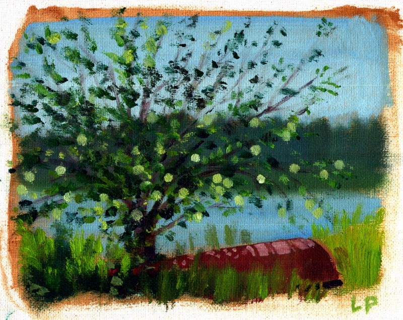

Crabapple&Canoe


They were done when our group went out to Willisville to paint on location.  I was actually pretty happy with them and wished we were staying longer.  It was my first time painting landscapes, first time painting with oils... and because of my schedule back home in the real world, that was it ...
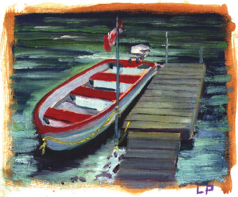
CanadianFlagBoat

... until last month, when we all went back to Whitefish Falls again!  This time I was determined to sink my teeth into painting - inspired largely by the discovery of the work of Albert Pucci in a couple of old Grumbacher "How to Paint..." books I had found in a used bookstore earlier this summer (you can read about Albert Pucci on my other blog, Today's Inspiration).   As well, I've been following the progress of a couple of friends, Michael Cole Manley and William Wray, who have been doing some fabulous, inspiring landscape paintings over the last couple of years.

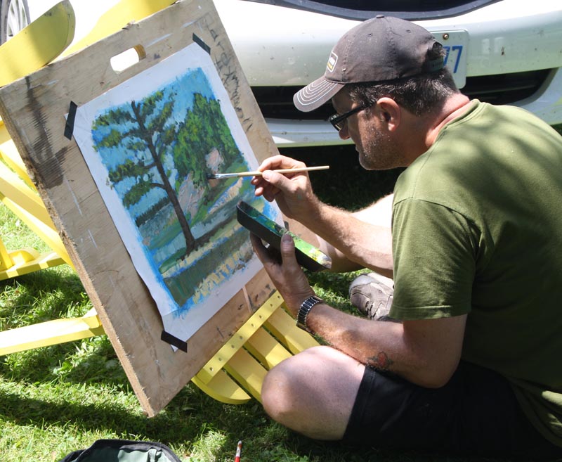
Anyway, things started off quite well... on the first day I managed to get one painting done.

LeifPainting01

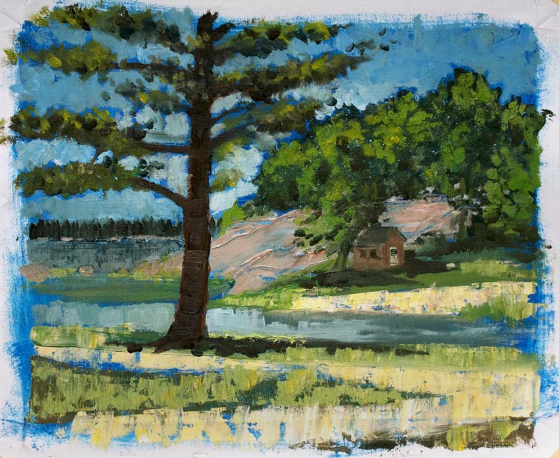
I spent about four hours on this, which was done mostly with palette knife, a technique I was really curious to try after reading the lessons in the Grumbacher books.
BayvillaGrounds

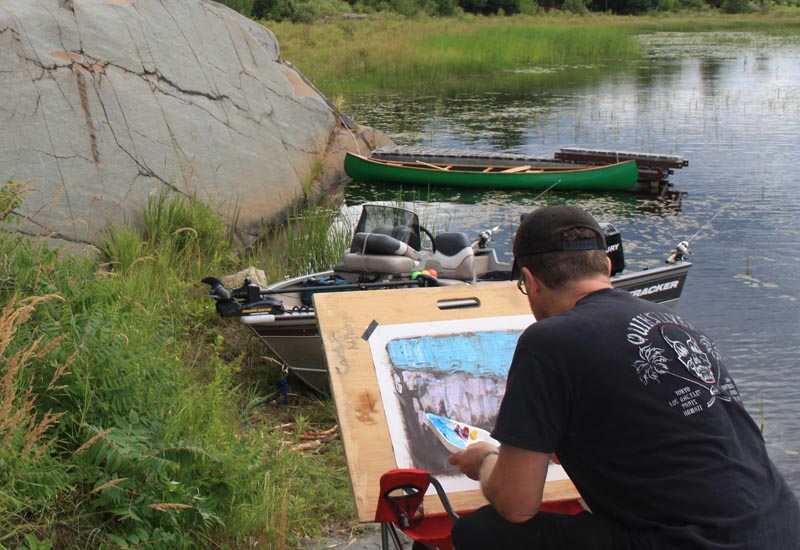
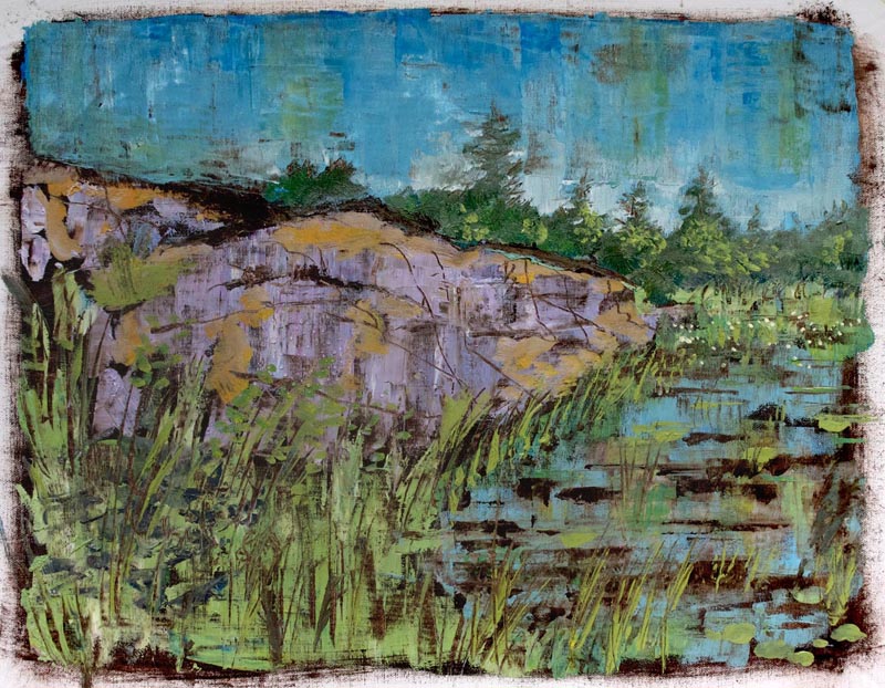
Day two (Tuesday) and I'm starting on my second painting, using a burnt umber ground like the one Pucci uses in one of his lessons.  Initially I included the bass boat  you see just beyond my artboard... but I was struggling with this piece, getting more and more frustrated.  Ultimately, my friends advised me the boat was the problem. They said the painting needed a dose of "Boat-be-gone."
LeifPainting02

So I scraped it out and went with just the natural features in the scene.  This was met with hearty approval from my ' painting advisory committee' and I have to agree.  Sometimes you need to edit your scene or else, as our instructor Richard Edwards explained, you get a painting that actually has two or even three paintings crammed into it.
OurBay

I passed this old rusted bulldozer every day on my way to get the morning paper at the variety store. Finally, on Wed. morning I went out at 6 AM and sat down to paint it in the rising sunlight. By 9 AM the light was gone so I planned to come back the following morning and finish it - but we had cloudy weather both Thursday & Friday morning. I hope to still go back in and work on this further. Interestingly, it was particularly well-received by a lot of the husbands of the women who were in the painting class!
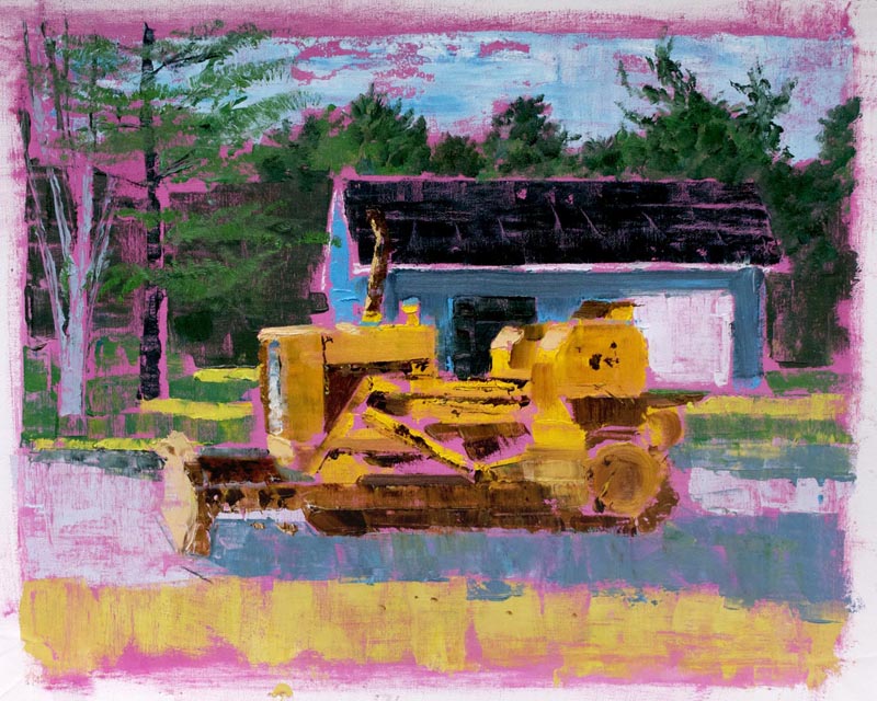
Bulldozer

This is a tough read, I know... its the view of an old abandoned hydro generating station built right into the cliffside on the opposite shore of a waterfall (which is not visible in this angle). The cliff is made of multi-coloured stone and part of the back interior wall of the station is exposed cliff face. Very cool, but probably looks very odd in my painting.
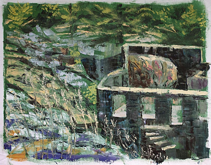
WhitfishFallsHydroStation

We spent the morning on top of Willisville Mountain, which is to the left of this scene, picking wild blueberries. So I only had about an hour and a half to whip this up. Looking across toward the tiny hamlet of Willisville.
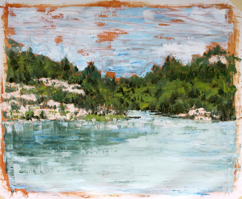
Willisville

That was my last effort up in Whitfish Falls.  The next day I drove to my friend Wade's family cottage, near Dwight, Ontario, on the Oxtongue River for our annual fishing derby.  I painted the piece below over about three hours on the Saturday afternoon of that weekend.
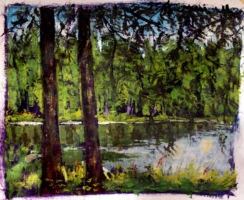
OxtongueRiver

Oh yeah, and I won the derby!

Friday, June 03, 2011

HBD to Me from Super Simon

June 1st was my 47th birthday. Super Simon presented me with this awesome birthday gift. Thanks Si!
HBDtoMefromSi

I need to post more of Simon's recent work. Hope to do so soon!

Sunday, February 20, 2011

What IF...

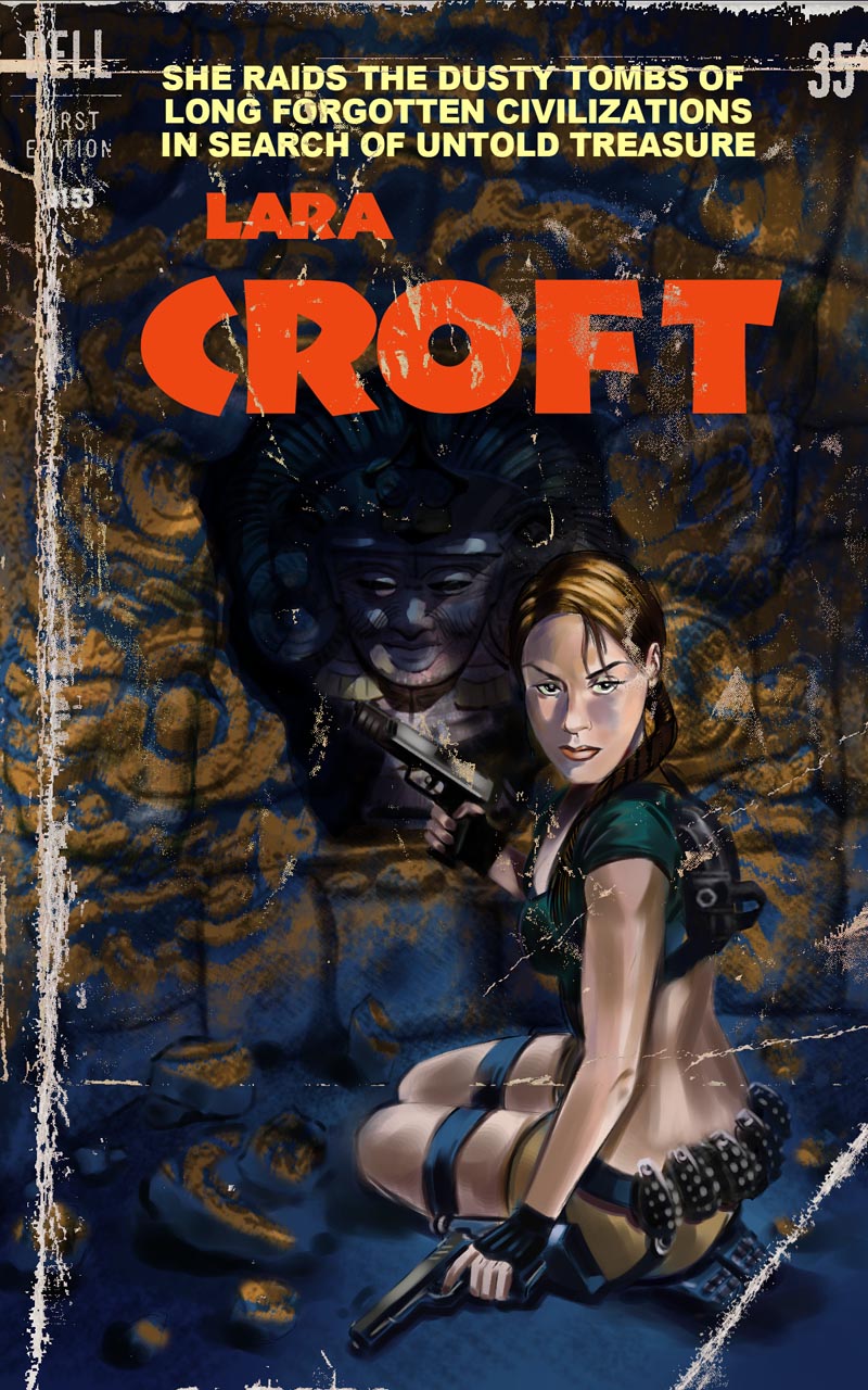
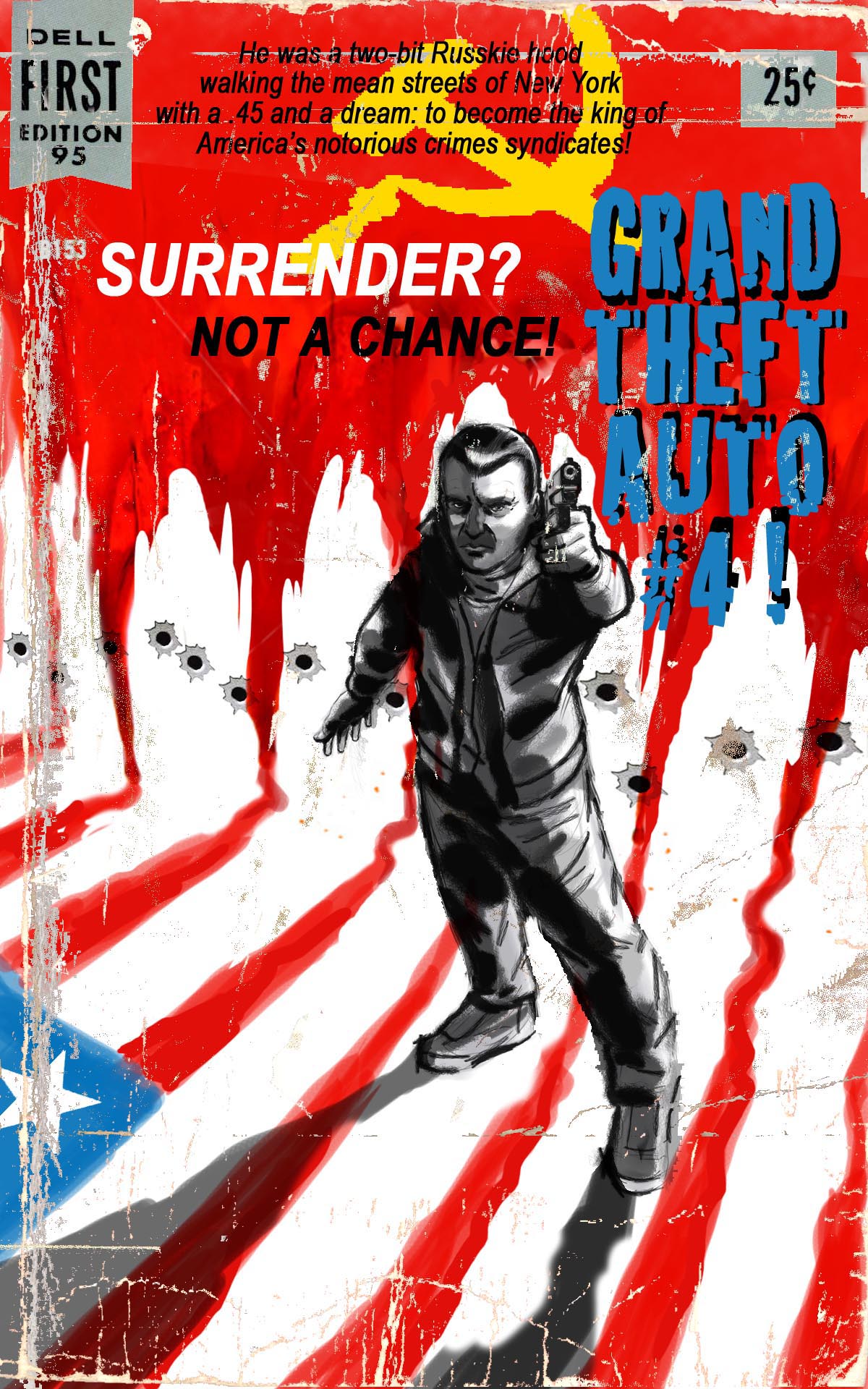
What IF... popular video game concepts had existed as paperback novel adventure series back in the '50s and '60s? I've been intrigued by the illustration styles and the graphic design of that era for some time now. Intrigued enough to want to try my hand at creating some mock vintage paperback covers of my own! Participating in Illustration Friday gave me the perfect opportunity to have some fun exploring the possibilities.

Here's my concept for the Illustration Friday word "Dusty"...

IF.Dusty.LaraCvr.final

... and "Surrender."

IF.Surrender.cvr

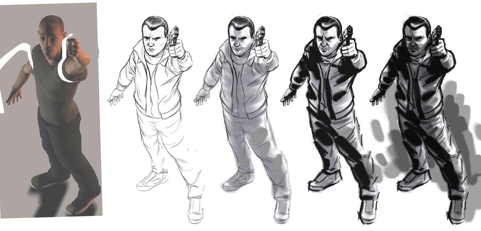
I was struggling to get GTA 4 star Nico Bellic to look right at that angle - so I built a model in Corel Poser to help me work up my initial sketch.

NikoBellicSteps

Now I'm working on the word "Reverse" (I know, I know, I'm, like, 3 weeks behind).

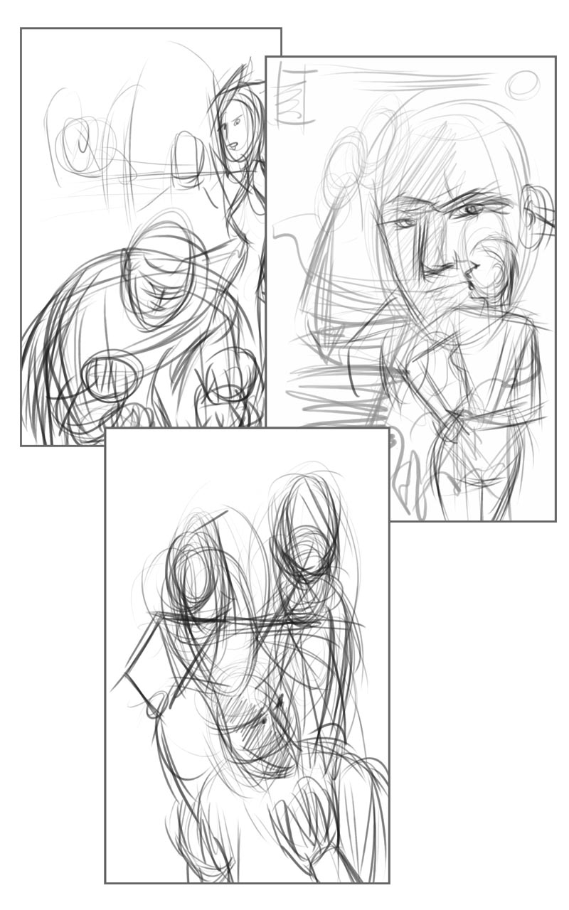
I've already got something in mind for the video game I'm going to mock up. I really want it to be a bit of an homage to the great Robert McGinnis' paperback covers...

IF.Reverse.thumbs

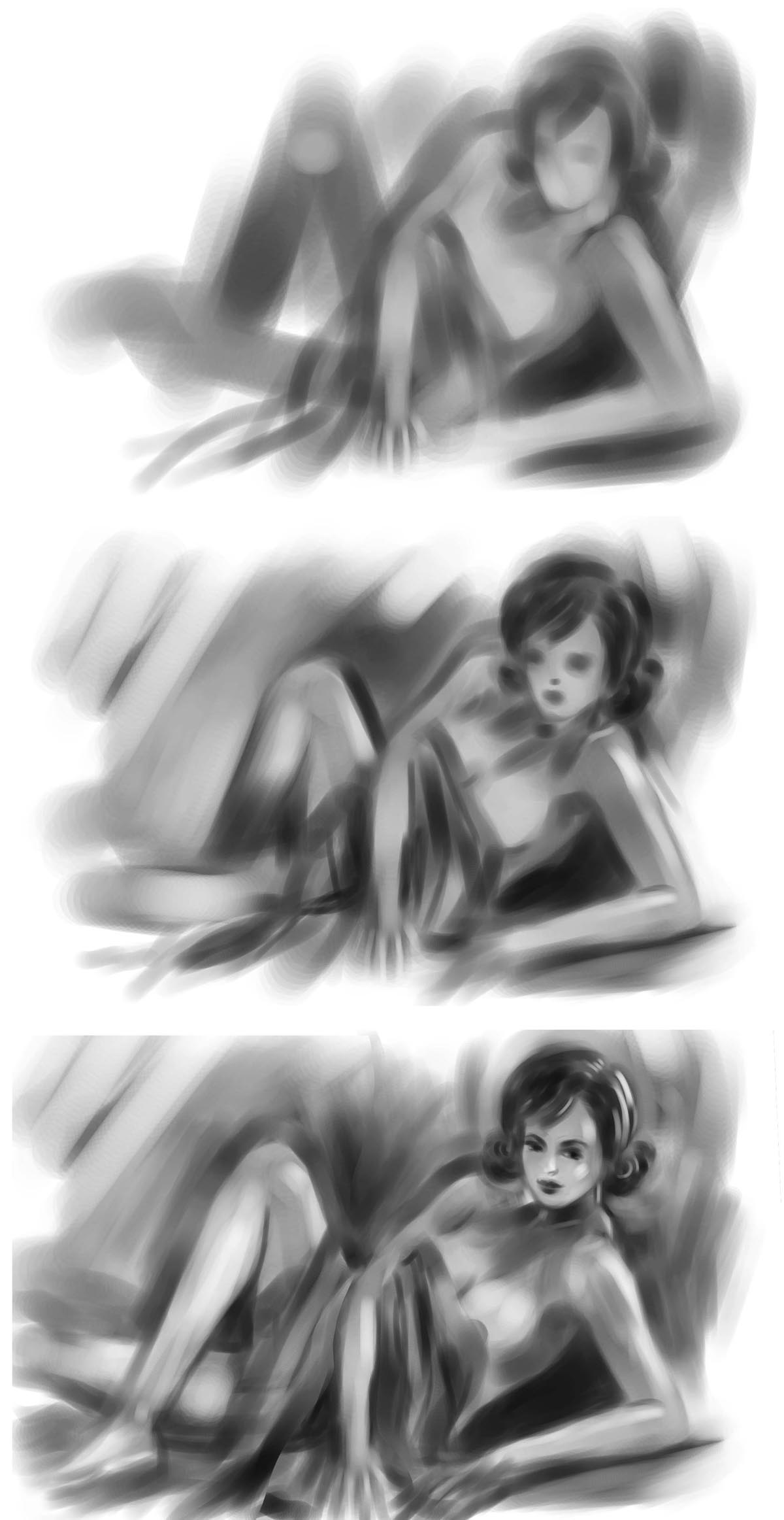
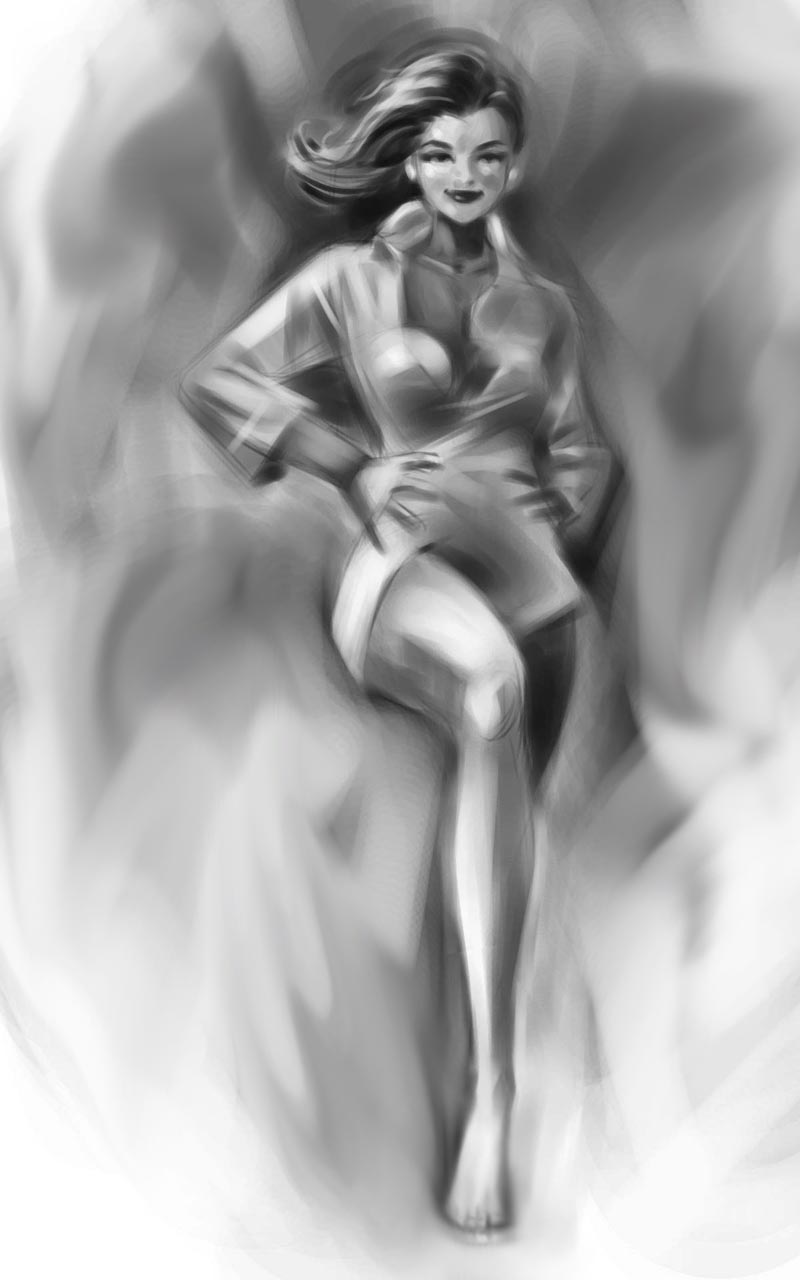
... and that means spending some time doing some drawings of gorgeous ladies.

IF.Reverse.girlstudy02

Oh, what a chore! ;^) For reference I used some old girlie magazines for these figure studies - just to - *ahem* - get the right period 'look', of course.

IF.Reverse.girlstudy01

I'm really going to take my time on this one, so check back now and then - I'll be adding more drawings as I work my way through the development of this piece.

* More of my Illustration Friday pictures here.

Monday, January 31, 2011

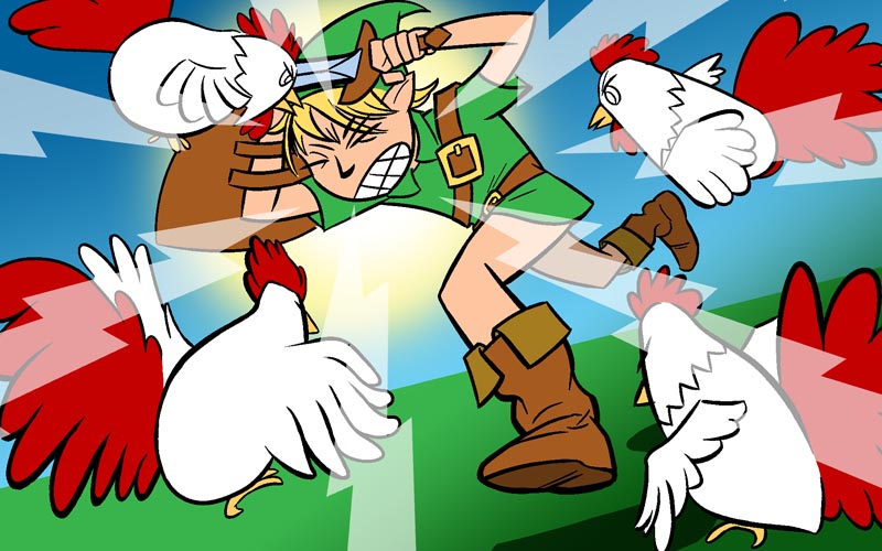
IF "Chicken"

This time around the word for Illustration Friday was "Chicken." Since I've decided to build up portfolio of video game-related artwork I racked my brain trying to come up with something fun that involved chickens.

Simon reminded me of the chicken attack in Zelda. Perfect!

IF.Chicken.sm

I remember watching the boys when they were young, playing Zelda - and how weird it was to see Link being chased around by a bunch of chickens. So here it is - my version of a Chicken Attack from Legend of Zelda!

More of my Illustration Friday images here.

Tuesday, January 18, 2011

Super Meat Boy Wallpaper for Desktop & iPhone

I've had some requests for wallpaper of this Super Meat Boy illustration I did last week, so here it is - thanks for the compliments!

Someone asked for 1920 x 1200... just click and then drag it to your desktop.


... and I made a version for iPhones too!


Edmund and Tommy at Team Meat, the creators of Super Meat Boy, both sent me nice notes that they liked my illustration - many thanks, guys!

Visit the Super Meat Boy blog

SMB is © Team Meat.

Sunday, January 16, 2011

Illustration Friday: Deja Vu!

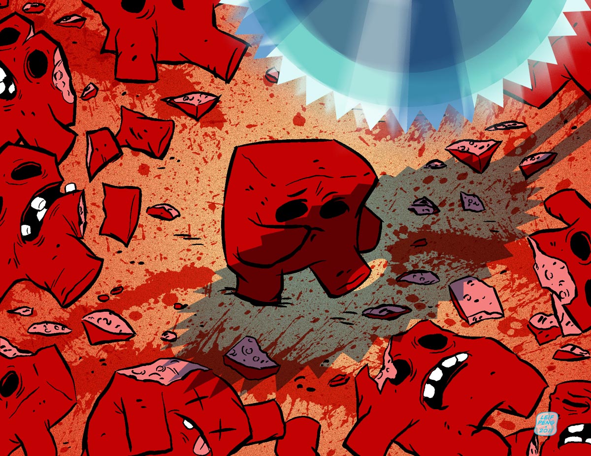
Have you heard of Super Meat Boy? My son, Simon, has been playing the video game like crazy recently. I'm not a gamer myself - but I've watched Simon play quite a bit and I have to admit, its a pretty wild concept. Its hard to drag your eyes away from the carnage of a little red cube of meat being slaughtered in a splash of blood over and over as he tries to dodge all manner of deadly buzzing saws.

IF.DejaVu.detail

When I looked at last week's Illustration Friday word, "deja vu", it made me think of Super Meat Boy... how he must surely experience a feeling of deja vu each time he leaps and zips past the blood stains left behind by his earlier incarnations.

Does he have a vague feeling of distress... does he realize he's been by here before and didn't succeed in rescuing Bandage Girl... ?

IF.DejaVu

More of my Illustration Friday illustrations here.

Sunday, November 28, 2010

A Textbook (Art) Example

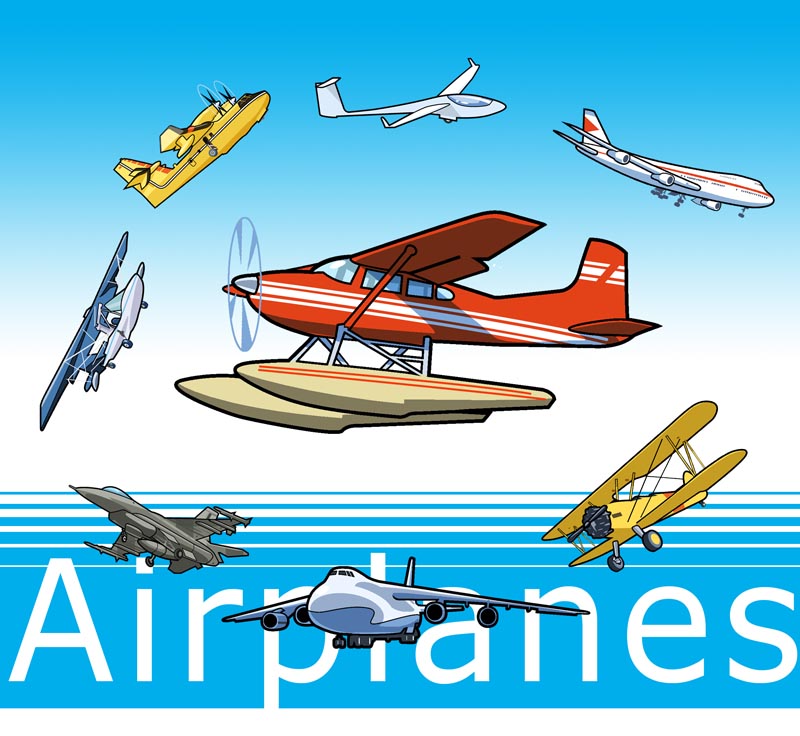
Earlier this year I did a whole pile of illustrations for a textbook series on vehicles and transportation. A WHOLE pile!

AirplaneGroup

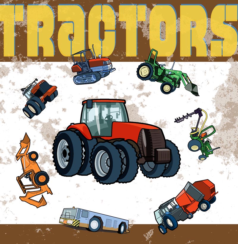
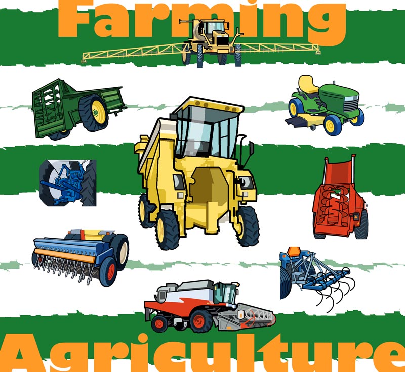
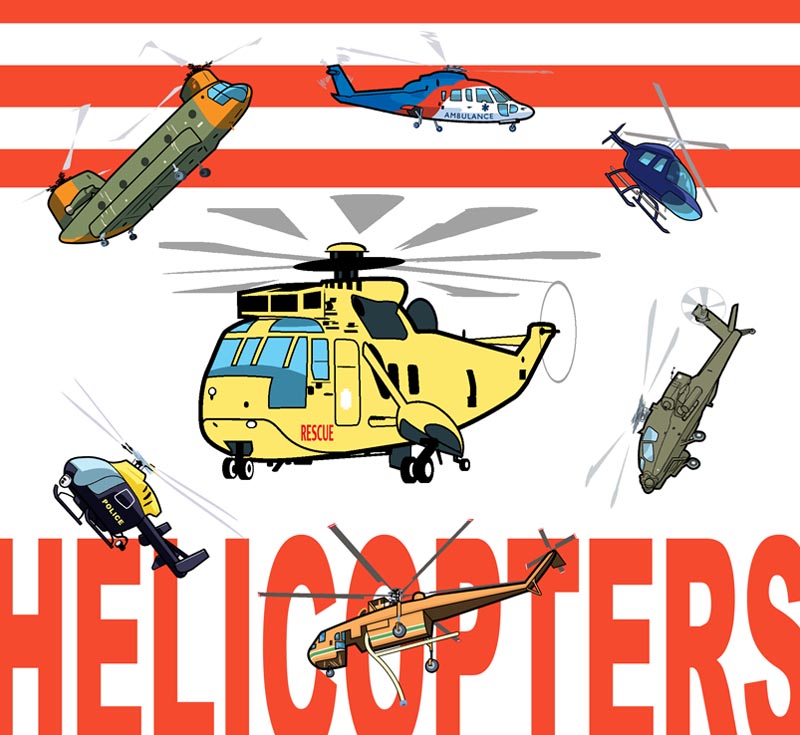
All of these vehicles illustrations were done as spots, to be inserted in various places along with text and photos. But to make things a little more interesting for presentation here on my blog, I decided to mock them up as imaginary covers. So don't bother looking for these at the library or in your six year old's knapsack. (I just made 'em up)

TractorsGroup

Normally I don't really love drawing vehicles because, *ahem*, I'm not very good at mechanical objects. But this came by way of a designer friend who specifically asked me to do them and I was looking for a little freelance to do on the weekends and evenings between teaching my classes.

FarmGroup

And as I worked on them, I was so happy with how they were turning out that it actually became quite a fun assignment.

HelicoptersGroup

Believe it or not, all of these vector-looking illustrations were done in Corel Painter. Why? Because I'm not an Illustrator illustrator. I've been using Painter for a few years now and find it quite versatile. I know, I know, I really, really need to learn how to use Illustrator. I've just been, you know... a little busy lately.

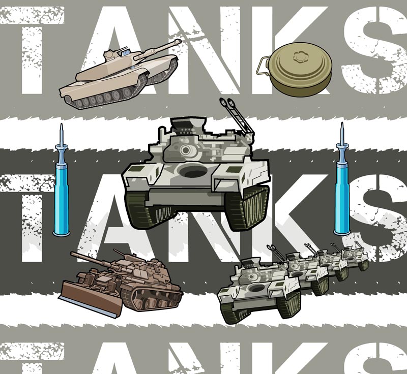
TanksGroup

Right now I'm working on another giant batch of vehicles for a new series of textbooks from the same client, so this seemed like the right time to show off the last batch.

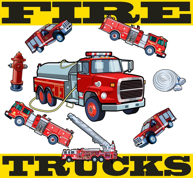
FiretrucksGroup

Hope you like 'em! Let me know what you think!

Sunday, November 21, 2010

Seven Spots for the Medical Post

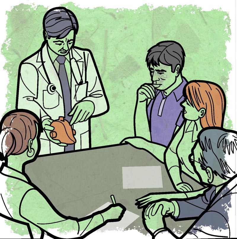
Here's a job that arrived on a Friday afternoon and had to be done on Monday morning: seven spots for the Medical Post. That's a LOT of art to complete in just two days, but I didn't have anything planned that weekend so... what the heck!

BrainInjury.flat

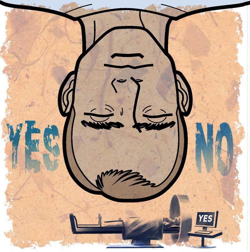
These first few are my favourites because I was able to devise these sort of interesting contrasting visual elements of the 'infographic' style juxtaposed with the more painterly style of the small figures. In retrospect, I wish I'd used this devise throughout the entire series, but "them's the breaks" when you're cranking stuff out at speed, I guess...

BehaviourEconomics.flat
VirtualPractice.flat

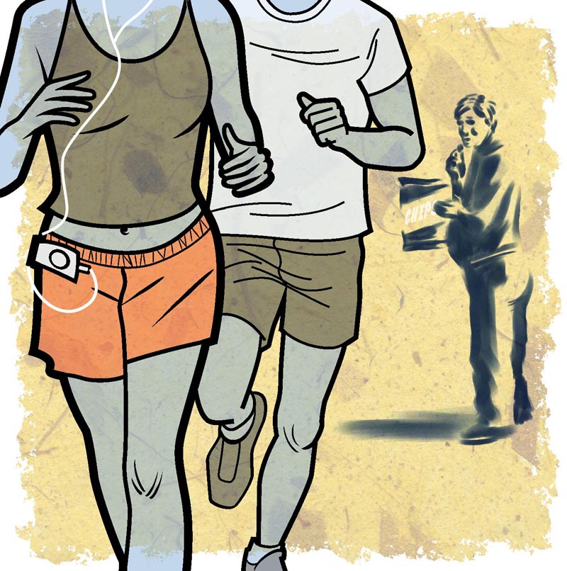
One thing I am really happy about is the handmade paper background element I used throughout. I think it works well as a nice unifying visual device - and is a little more interesting than the typical flat colour treatment you see in most infographics. I felt that by adding something 'organic' to the mix it would balance images that otherwise could end up with a very cold, technical look because of the the line art style.

GroupVisits.flat

Yeah, I know this one looks very odd. Apparently doctors are using honey to treat burns. Go figure!

Honey.flat

All of these were printed at about 3" by 3", in case you're wondering. Not too small, but small enough to best be served by a simple style, which is why the AD asked for this bold line style I used.

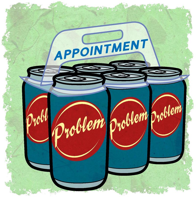
MedAbbApps.flat

This last one with the six-pack was added late in the game and without any concept sketch from me - just a quick email describing what was wanted. Because of the subject matter it feels to me a bit out of place with the rest of the spots, but I did like how it turned out.

MaxPacking.flat

So there you have it -- seven spots for the Medical Post!

Sunday, September 19, 2010

The Return of SuperSimonSundays!!!

After a long summer of endless hours in a horizontal position on the couch in the back room, Playstation controller firmly affixed to both hands, Super Si returns to school, to his Grade 11 Entrepreneurship Class, to bring you...

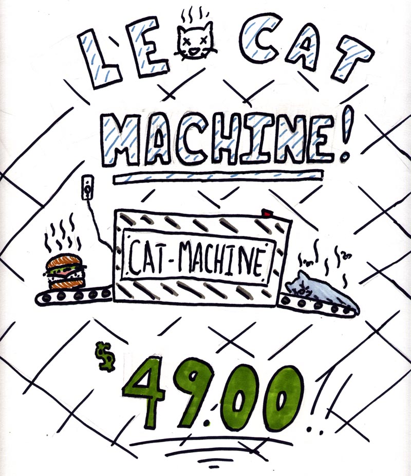
Le Cat Machine!
written and illustrated by Simon Peng
© 2010 SuperSi Enterprises (Patent pending)

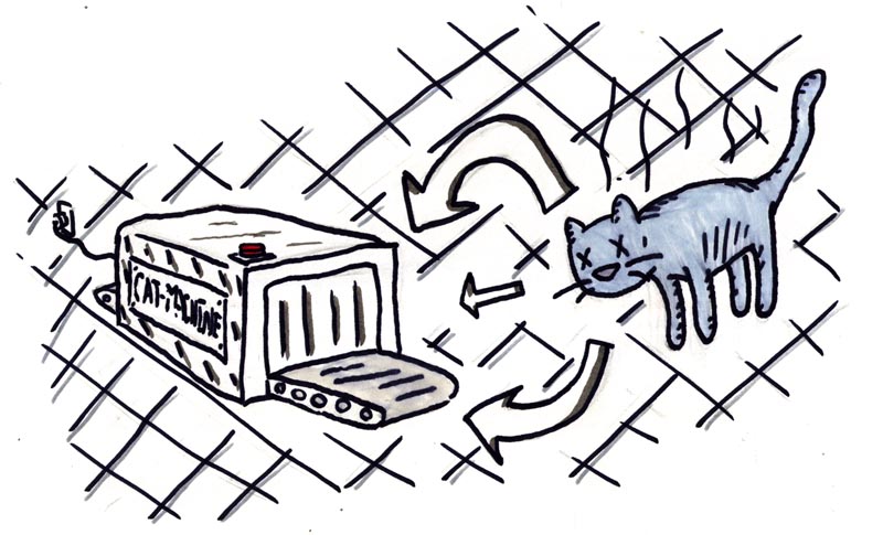
LeCatMachine01a

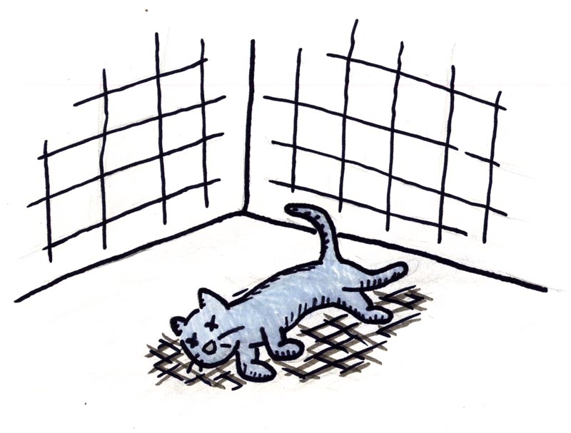
The cat died!

LeCatMachine01b

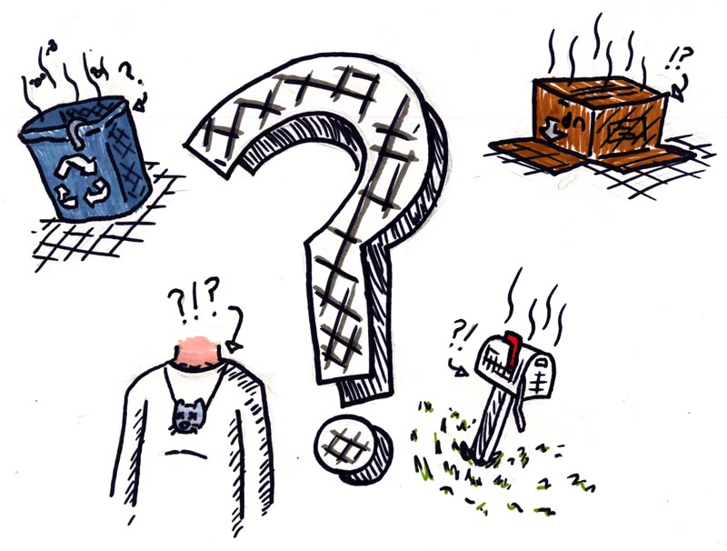
What to do...?

LeCatMachine02

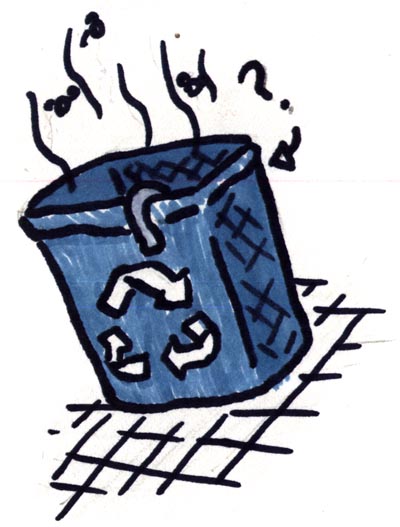
Recycle it?

LeCatMachine02a

Hide it under a cardboard box...?

LeCatMachine02b

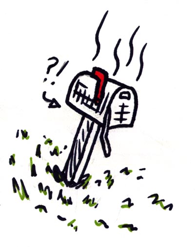
Stash it in the neighbour's mailbox?

LeCatMachine02c

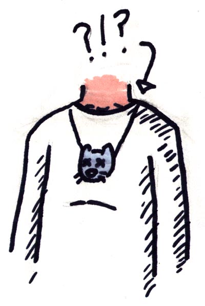
Make an attractive hand-crafted dead cat head pendant???

LeCatMachine02d

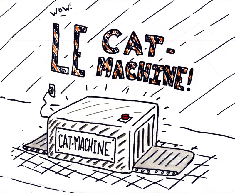
Introducing "Le Cat Machine!" (plugs into any standard home outlet)

LeCatMachine03

Simply take your dead stinking cat and place it on the handy conveyor belt...

LeCatMachine04

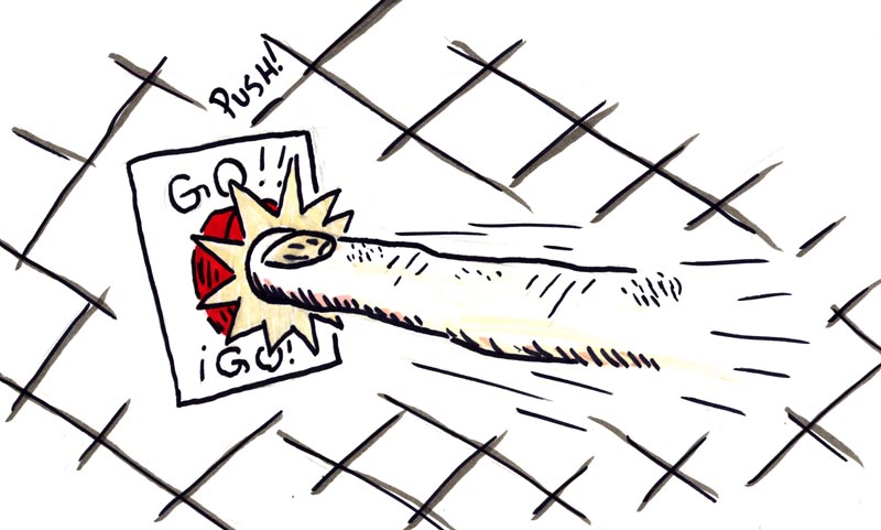
Press the start button...

LeCatMachine05

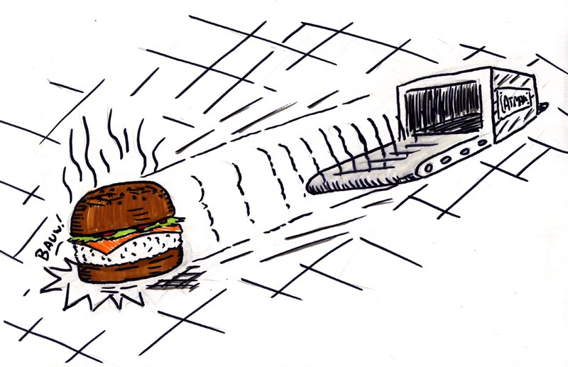
... and voilĂ ! A tasty burger!

LeCatMachine06

"Le Cat Machine" - for all your dead cat needs - only $49.00!

LeCatMachine07

(plus shipping and handling)

Saturday, September 11, 2010

Promotional Illustrations

I've been an instructor in the Graphic Design program at Mohawk College since January, 2010.  Check out the full program description here.

This semester I'm teaching a course called "Promotional Illustrations," something I'm very familiar with.

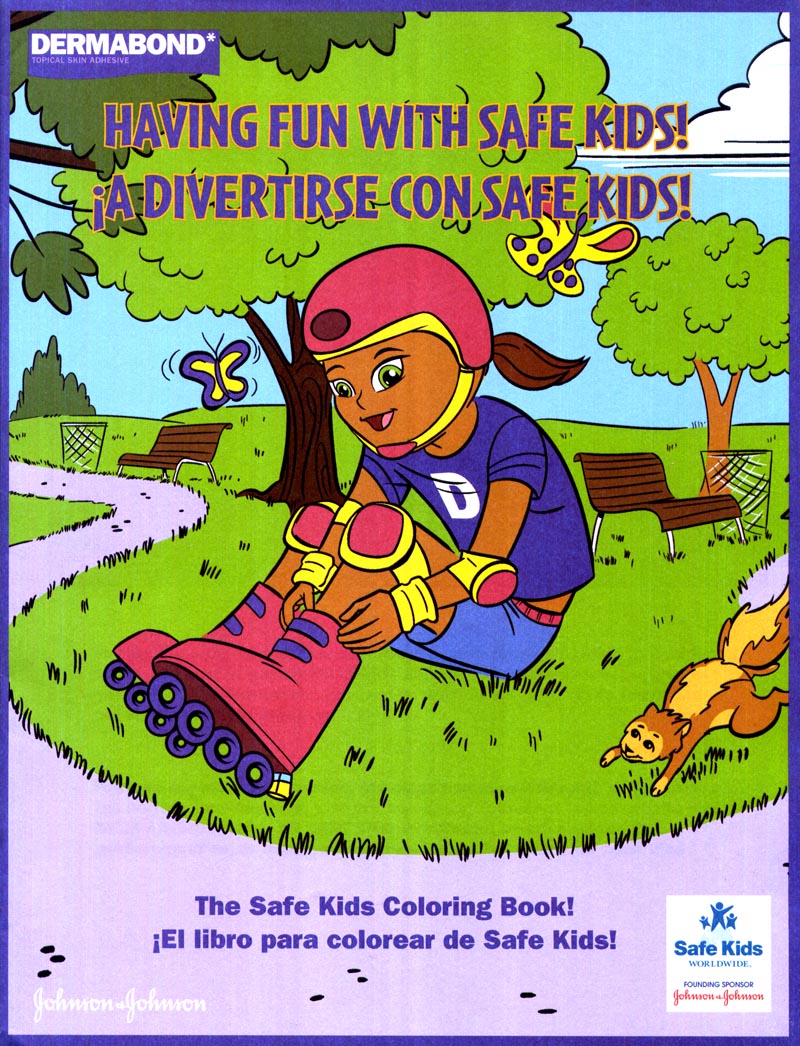
DermabondColouringBk.Cvr
Dermabond promotional colouring book

Doing illustrations - both concept and finished art - related to the promotion of products or services has always been a major component of my work.

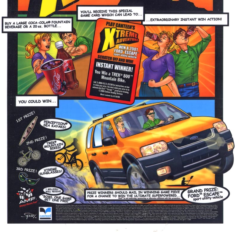
Coke.CounterCard
Coke contest counter card

For the benefit of my class ( and for anyone else who might be interested ) I thought I'd show a few of the projects that have passed across my drawing board in the last 20 years.

Promotional Concept Illustrations


As a storyboard/concept/layout artist, I'm often called upon to draw up ideas generated by art directors at marketing and promotions companies.  Now, unlike the assignments my students are working on,  I can't take any credit for coming up with these concepts.  The ADs who hired me did the (often clever, sometimes not) thinking and called upon me to visualize what their concept would look like for the purpose of presenting it to their client.

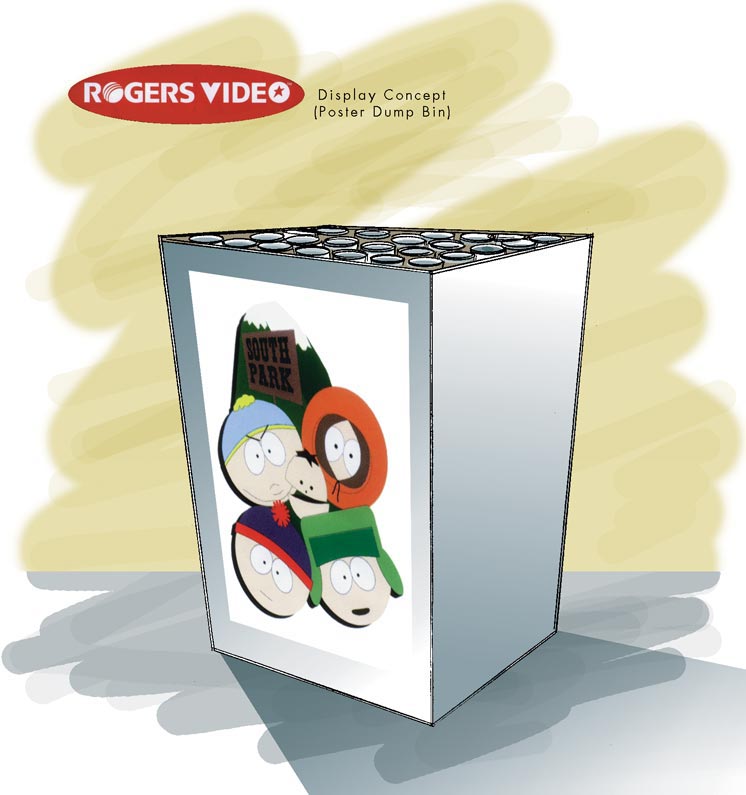
Sometimes the artwork is about as close to utilitarian as you can imagine.  These drawings for a South Park poster dump bin...

RogersDisplayUnitDumpbin

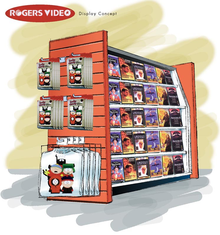
... and for a video store end-aisle merchandiser...

RogersDisplayUnit02

... are intended to do nothing more than explain to the video chain store's executives what their store would look like with South Park merchandise in it.

Yes, business people are sometime so visually inept that they need something this obvious to 'get it'!

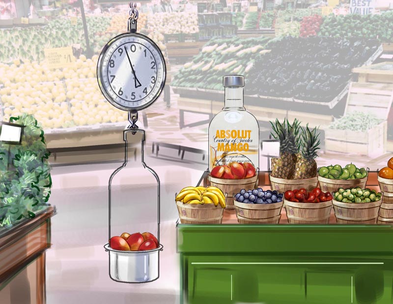
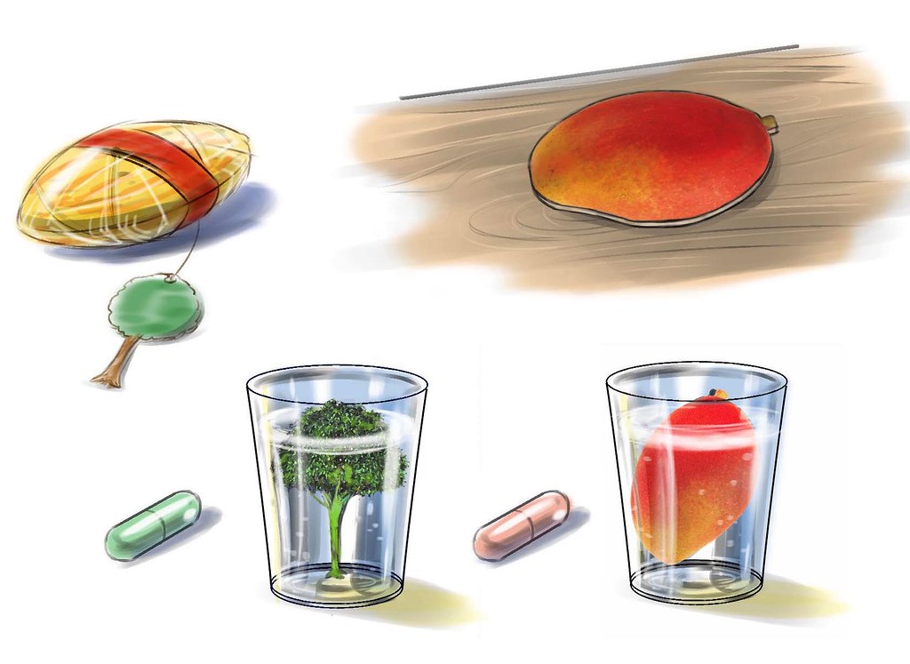
Here's another concept illustration for an in-store promotion -- this time for Absolut Mango Vodka.  Here the promo concept is much more clever:  the AD proposes that the grocery store chain replace their regular hanging weigh scales near the fresh fruit section (where the mangos would be kept, right?) with weigh scales shaped like a silhouette of an Absolut Vodka bottle.  Clever.

Absolute.GroceryStore

And to compliment the promotion, he devised an oversized plastic "dome" shaped like an Absolute bottle to be placed over the mangos, with an oval 'doorway' cut into it so you can reach in and grab a mango.  Nice!

Because this was ( as usual ) needed at double-quick speed, I used some found photography as a background element for the drawing.  You wouldn't be able to do this if you were producing finished art for publication, but in the hyper-fast paced world of advertising presentation art, you use whatever trick will get a decent looking visual to the client meeting on deadline!

Below, a few fun Absolut Mango promo items the AD asked me to visualize for him:  a shrink-wrapped mango pit ready for planting (instructions on the mango tree-shaped hang tag), a mango-shaped bar coaster, and a couple of those little gel caps you put in water that grow something after 24 hours, in this case, a mango tree or an actual mango.

Absolute.PromoItems
All these items would have been branded with Absolut Mango Vodka logos before being presented at the client meeting, of course.

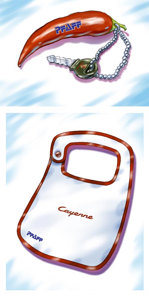
Next up, a couple of promotional merchandise ideas for the launch of the Porche Cayenne.  The keychain in the shape of a cayenne pepper seems like a natural...

Porche. PromoKeychain.Bib

... but what's with the bib?  The AD's idea was to suggest that, once you get a look at the new Porche Cayenne, you won't be able to stop drooling (the merch would be personalized with the dealer's name, in this case, Pfaff Porche in Woodbridge, Ontario).

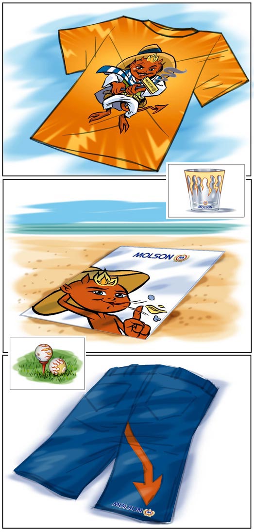
Below, some promo merch concepts for Molson's.  This stuff wasn't even for public consumption - this promo was intended for a weekend getaway at a Mexican resort for beer reps!
Molson.PromoApparel

(Incidentally, I was also commissioned to design the little devil mascot that appeared throughout this promo)

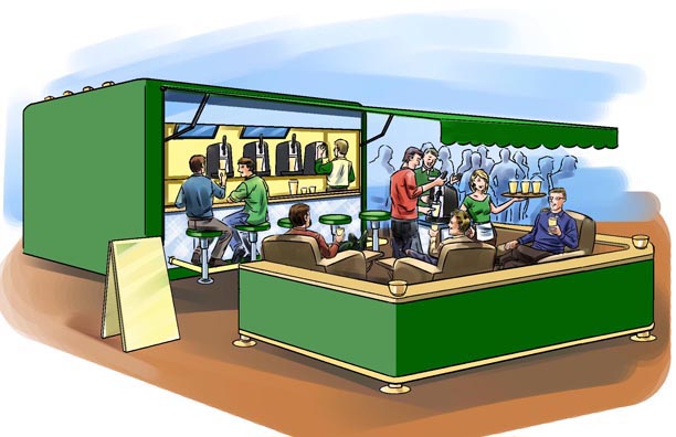
And finally, some drawings for a promo "event marketing" concept:  a mobile Carlberg beer garden.

Carlsberg01.sm

The idea here is that you put a bar in a trailer and pull it to various festivals and outdoor events.  Everything folds right out and - voila! - instant bar!

(Again, keep in mind that these illustrations would have been branded with Carlsberg logos before the agency showed them to the client.  The reason you don't see that in these drawings is because the art director said he'd take care of it in-house)

Carlsberg02.sm

Also, remember that all of the drawings above are "concept drawings" only - never to be published - only for client meeting presentation, and thus not required to be finished to the same degree as artwork that would actually be viewed by the consumer market.

Some examples of the promotional illustrations I've done that were ultimately printed are coming up just below...

Promotional Finished Art Illustrations


Flyers, coupons, P.O.P. material, promo t-shirts; they all need visuals to help the client promote their goods or services.  Sometimes those visuals are photography or graphics ( like logos and such ) - but in many cases the ideal visual will be an illustration.  Over the years I've done more promotional illustrations than I can possibly recall.

Below, an illustration for Heinz ketchup that was used for an in-store backer card, if I remember correctly.  From the looks of that cartridge Mario is holding, many of you who were avid gamers while growing up will appreciate that this piece was done a loooong time ago!  Unfortunately I rarely get printed samples from my clients once I've delivered the art so I don't have any type elements to remind me what the heck this was for.  A contest to win a free Super Mario game, I think...

Mario-Heintz.POP

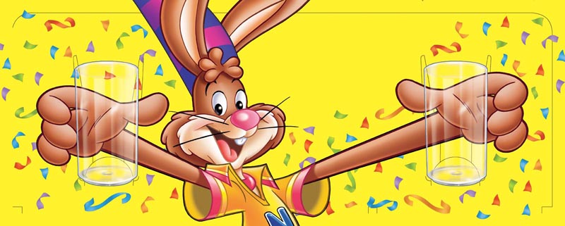
Here's another backer card, this time for a Nestle's Quik promo where you got a free glass with purchase (the glass would have had some Quik Bunny artwork on it before this went to the printer)...

Quik.HeaderCard

This is a good example of the important role illustration can play in the promotion of a product.  Even though photography could have been used for the image of the clear glasses in the bunny's hands, the client wanted to retain an element of "illustrative realism" to connect the glass more effectively with the bunny.

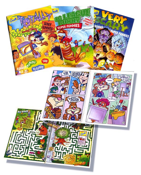
And yet another Nestle's Quik promotion:  three on-pack Quik Bunny comics I produced for a marketing and promotions company back in the 1990s.

Quik.PromoComic

These were digest-sized comics/activity booklets shrink-wrapped right onto boxes of Nestle's Quik chocolate powder ("Collect all three!")

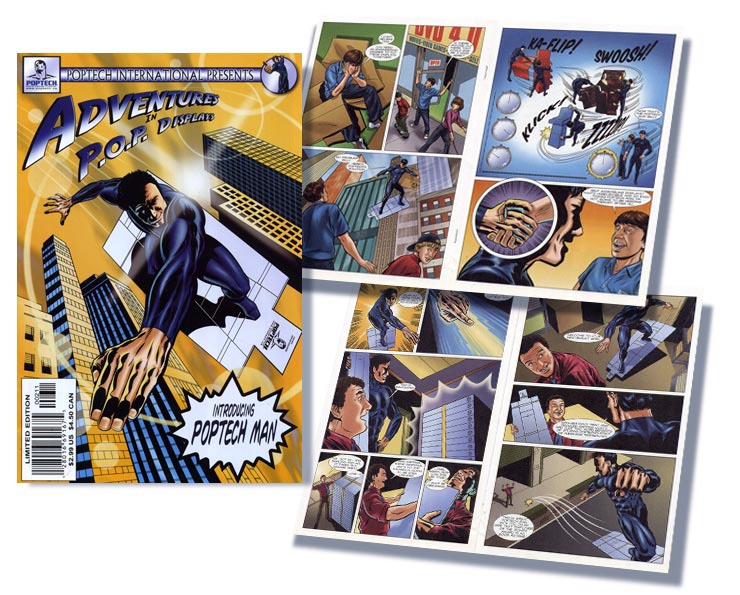
Promotional comics have been popular for most of the last hundred years - and over the last twenty years, I've done quite a few for advertising clients and charitable organizations.

Poptech.PromoComic


The example above is unique in my portfolio because it wasn't done for the consumer market.  This comic was done for a cardboard engineering and manufacturing company and sent out as a "business-to-business" promotion.

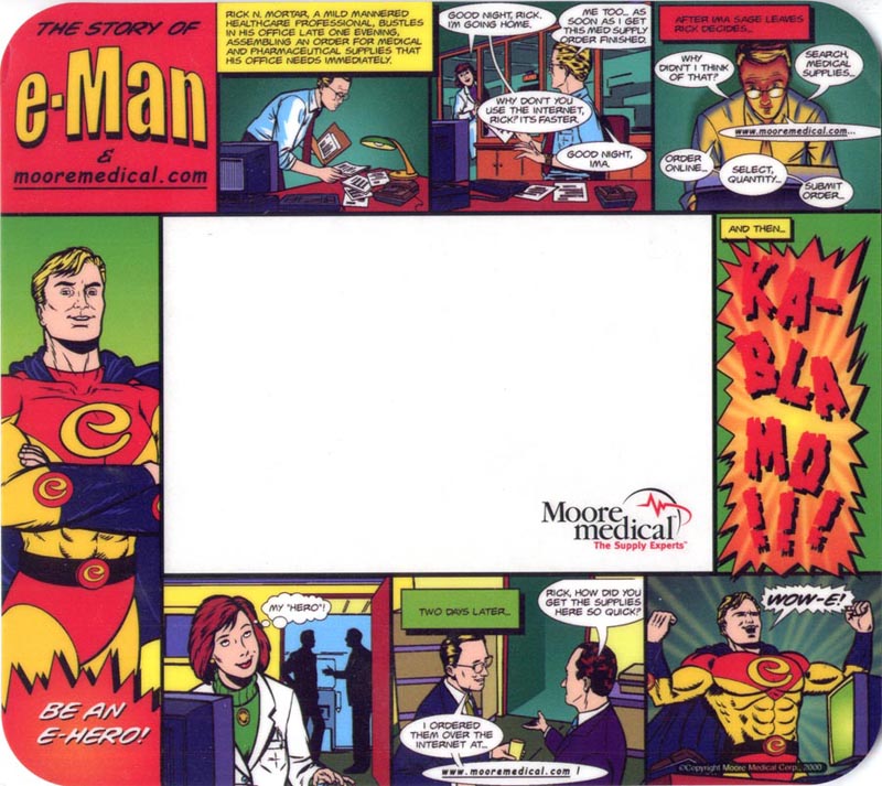
Similarly, the mouse pad below was created for a pharmaceutical company and used as a "B-2-B" promotional item.

E-ManMousepad

Here's another backer card that was used for an in-store display, this time for Lay's.

Chester01

And at last, a printed sample!  A tent card for Campbell's Soup with all the type elements in place.

*1537 Tent_Card_SOUP-r2

Incidentally, I also did the character design for these veggies, which were turned into plush toys for the purpose of the promotion.

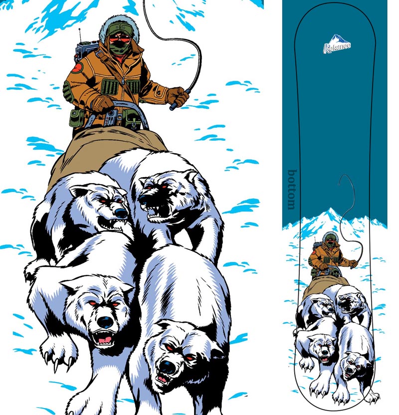
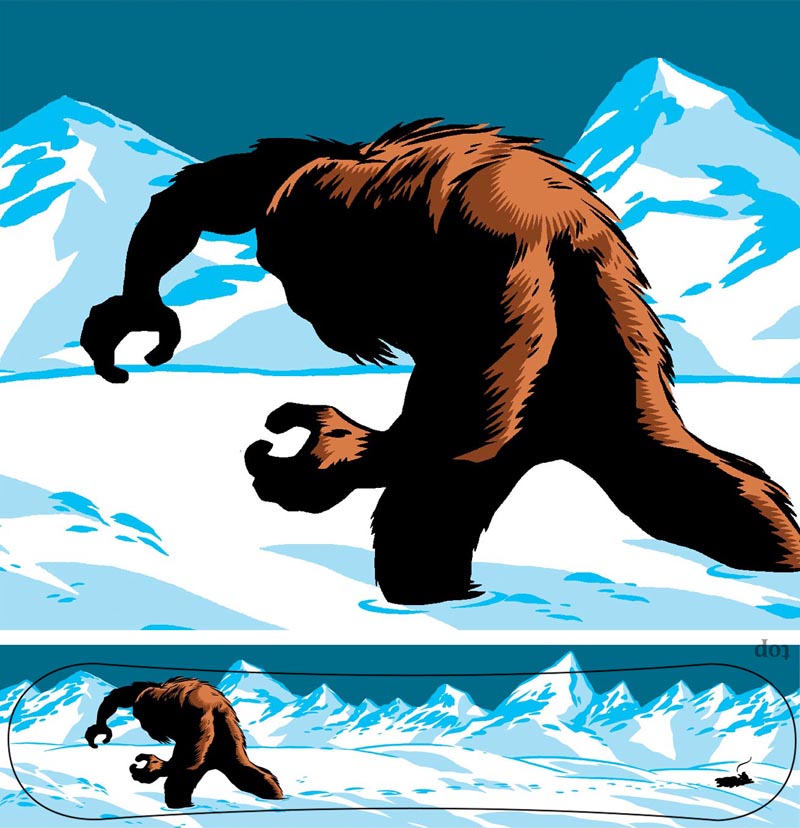
And finally, one of the most unique promo's I've ever had the privilege of working on:  a limited edition Kokanee beer snowboard that was given away as the prize in a promotional contest.

KokaneeSasquatch.bottom
The bottom...

KokaneeSasquatch.top
...and the top.


Hope you enjoyed these examples  and I hope they gave you some ideas for your assignments.  Feel free to leave comments or ask questions!